Redesigning parts of our homepage
Published on November 30, 2018 by Mattias Geniar

We've launched a fresh now look for the Oh Dear! homepage and a lot of tweaks to the overall look & feel of the public facing pages of our site. Allow us to show those changes in more detail!
A fresh, clean homepage #
This is visually the most noticeable change we've pushed. When we first launched, our design looked like this.
We liked that design quite a bit. It stood out. You don't see many startups foolish enough to make their entire homepage screaming red. It was also sort-of a reference to the red error screens you'd see when a site certificated had expired in the browser.
But, the number one piece of feedback we received was: "aargh my eyes!".
And, well, we couldn't blame them. :-)
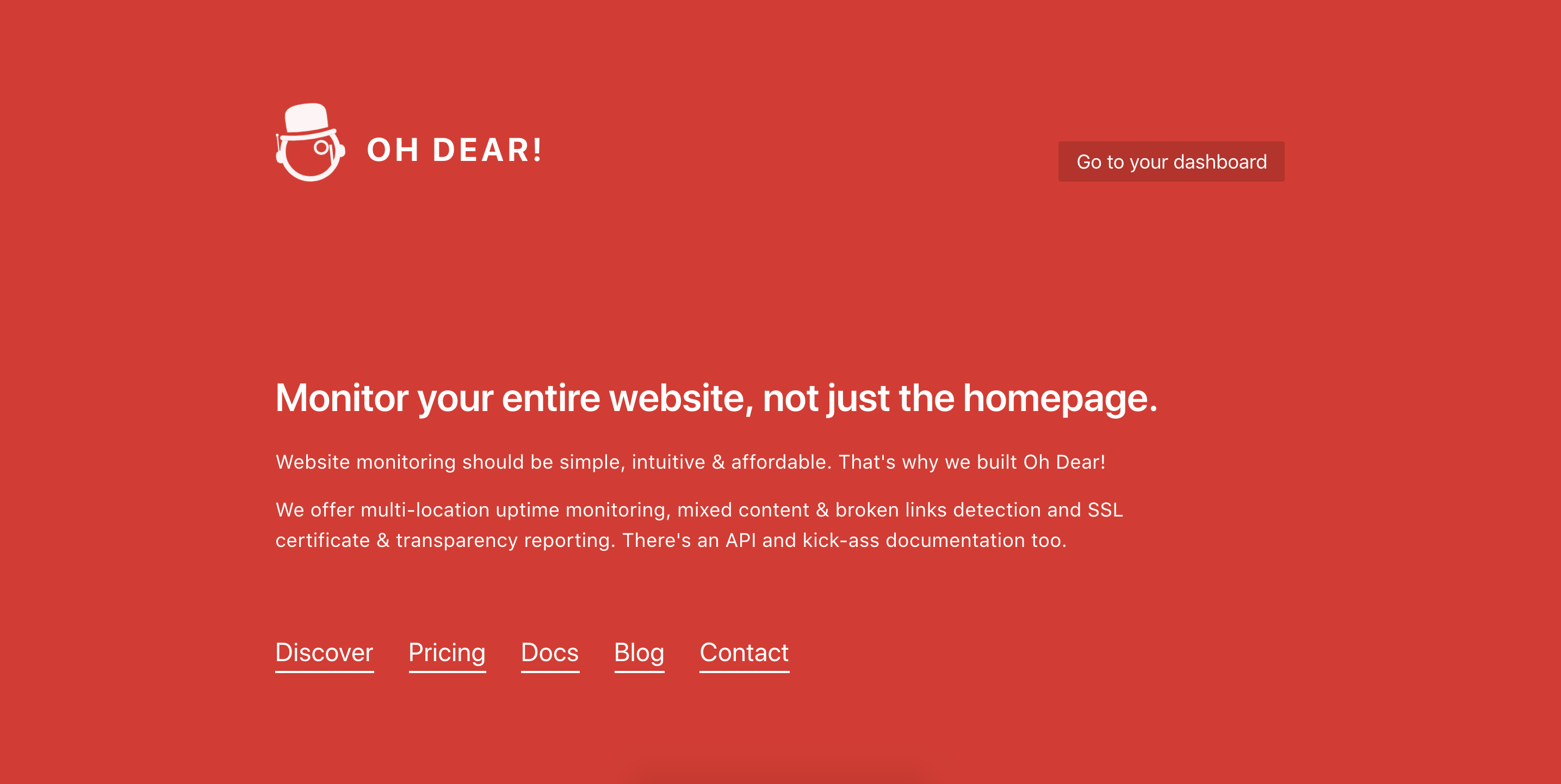
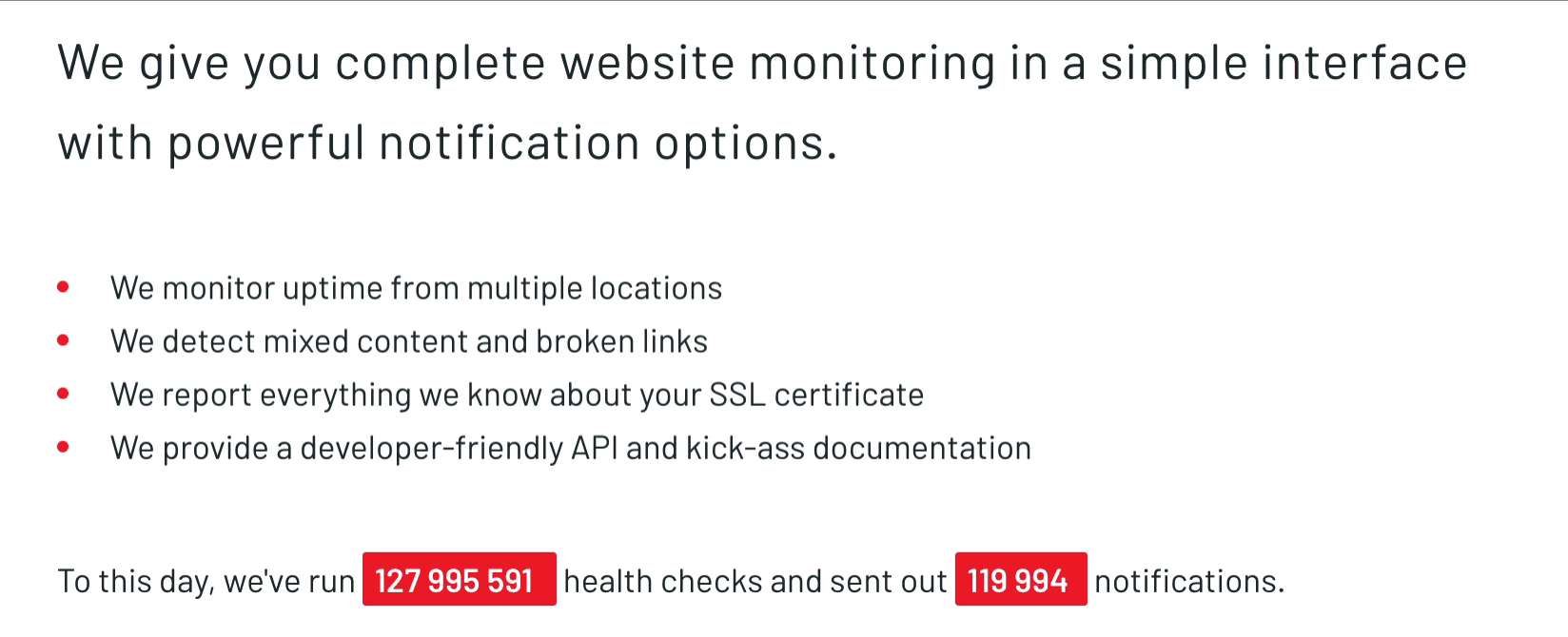
So here's a freshly designed homepage, easier on the eyes with updated text to showcase what we do and what our strenghts are.
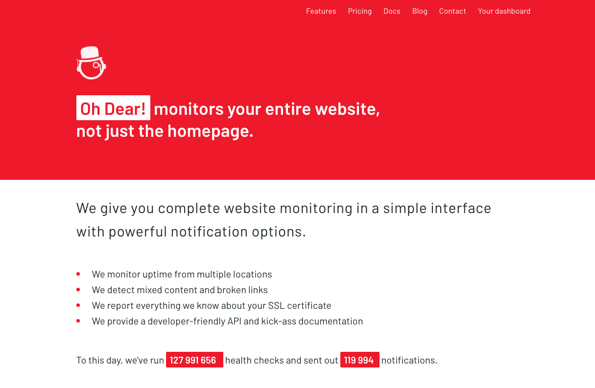
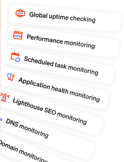
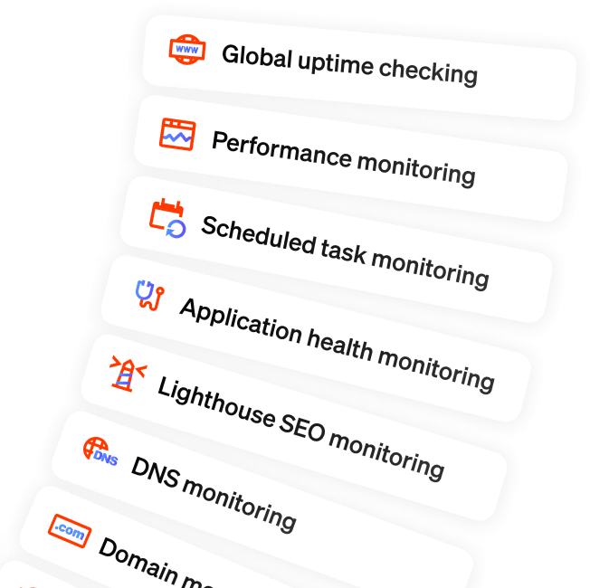
There's still some screaming red involved, but it doesn't cover the entire homepage anymore. Besides highlighting what we're good at (doing more in terms of website monitoring than most of our competitors) we also have a live counter of the amount of checks we've run so far, refreshed live through the use of websockets.
Everything inside Oh Dear! is powered by websockets, now a part of the public facing website is too!
Updated blogpost design #
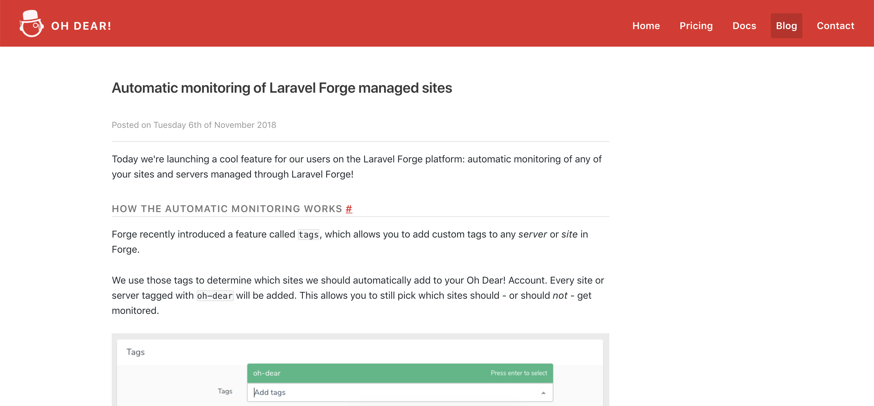
This is a bit meta as you're already reading this on our blog, but this design got some nice tweaks too. Here's what it looked like before.
It was functional, but not pretty.
Here's that same blogpost with a new coat of paint.
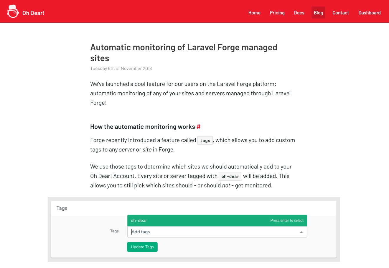
The images get highlighted more (extending the width of the text), clearer headings and some updated typography.
Highlighting our user testimonials & quotes #
One thing we're very proud of is the feedback we receive from our users. Some big names in our industry have publicly endorsed us and we definitely want to showcase those.
At first, our quotes on the homepage looked like this.
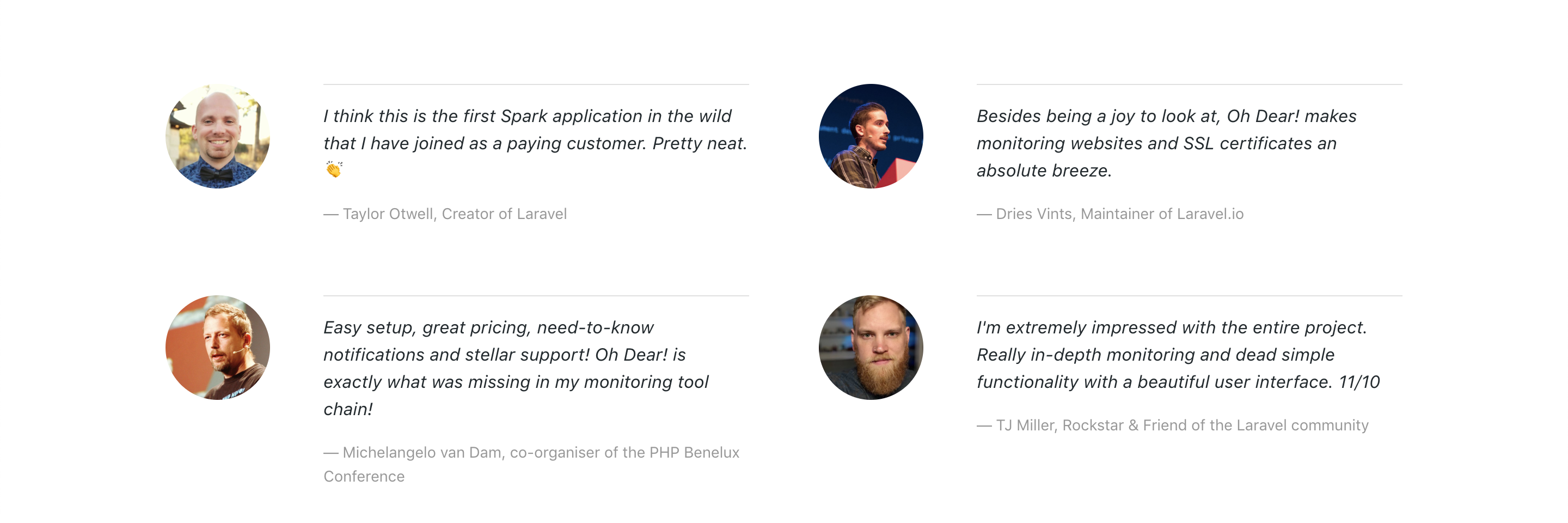
Since we were actually starting to accumulate so many positive quotes, we needed a new design to feature more. This is the current layout we have.
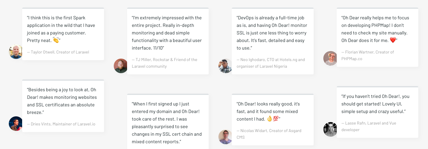
More content horizontally and an updated zig-zag layout to break the symmetry on the page.
Tweaks to the pricing & documentation #
We applied the same design principles to our pricing and documentation too. We've improved readability by adding contrast between titles & text and by increasing the font-size and line height slightly.
Behind the scenes, we've been extending our documentation quite a lot too, which meant our left-hand menu was growing to be a bit too big. That now auto-folds to highlight the current category.
Many of those pages just look a lot better too, like our API documentation on uptime reporting or how to use our API and manage your sites.
At the same time we added a section to highlight all 3rd party integrations that make use of our API. There's already a Terraform provider, a Telegram chatbot and a CLI client available to talk to Oh Dear! - how cool is that?
If you find areas of our site or application that needs improvements, we'd love to hear about them!