A preview of our upcoming redesign
Published on August 18, 2022 by Freek Van der Herten

Earlier this year, we announced that one of our goals for this year is to bring the UI of Oh Dear to the next level. Behind the scenes, our team is working hard on a complete rewrite of our marketing website and app.
We're currently targeting the end of September timeframe to launch our redesign. In this blog post, we'd like to give you a preview of the redesign.
The marketing site #
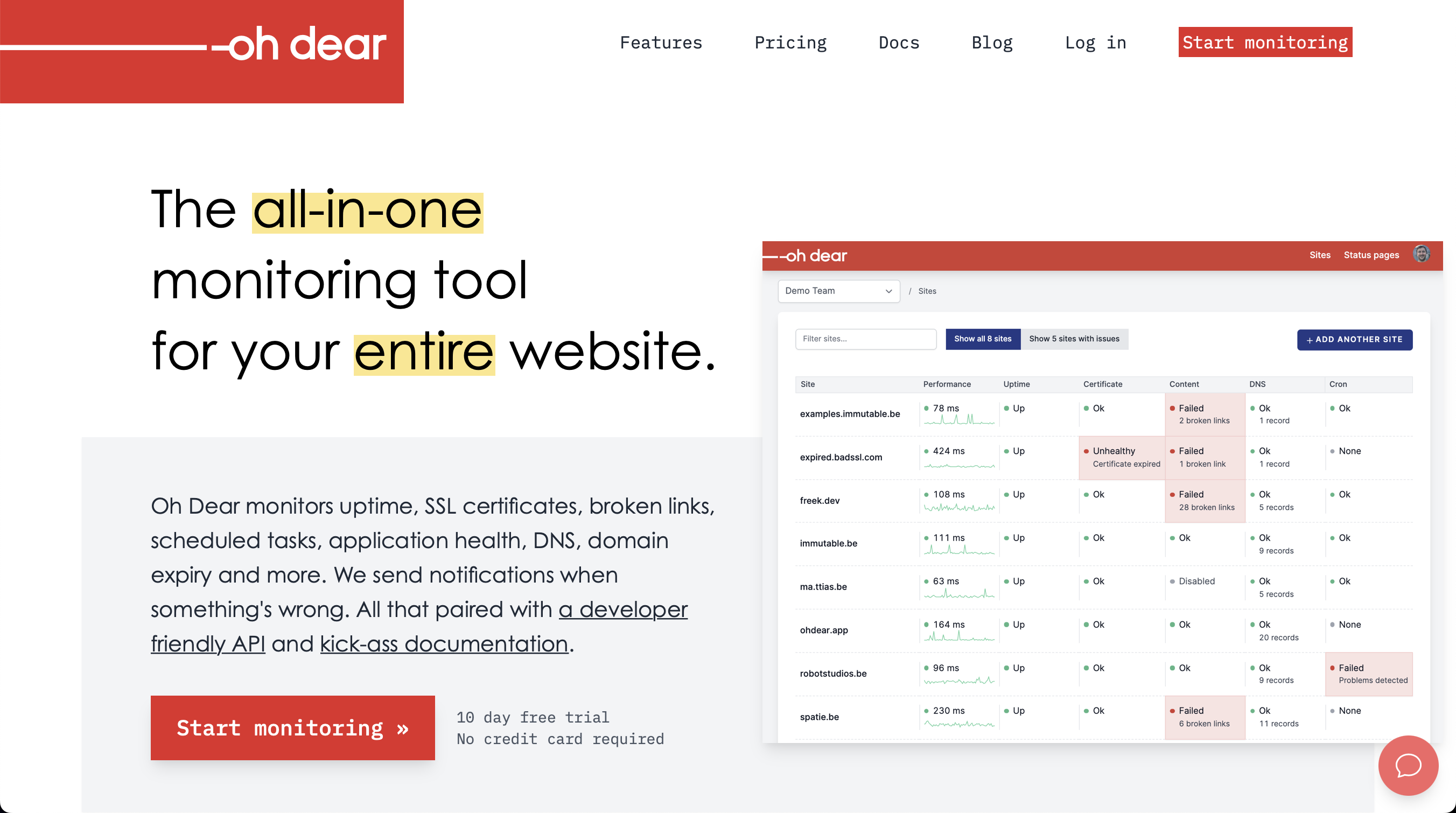
One of the most important pages is, of course, the homepage. Here's what our current one looks like.
And here's the redesigned one:
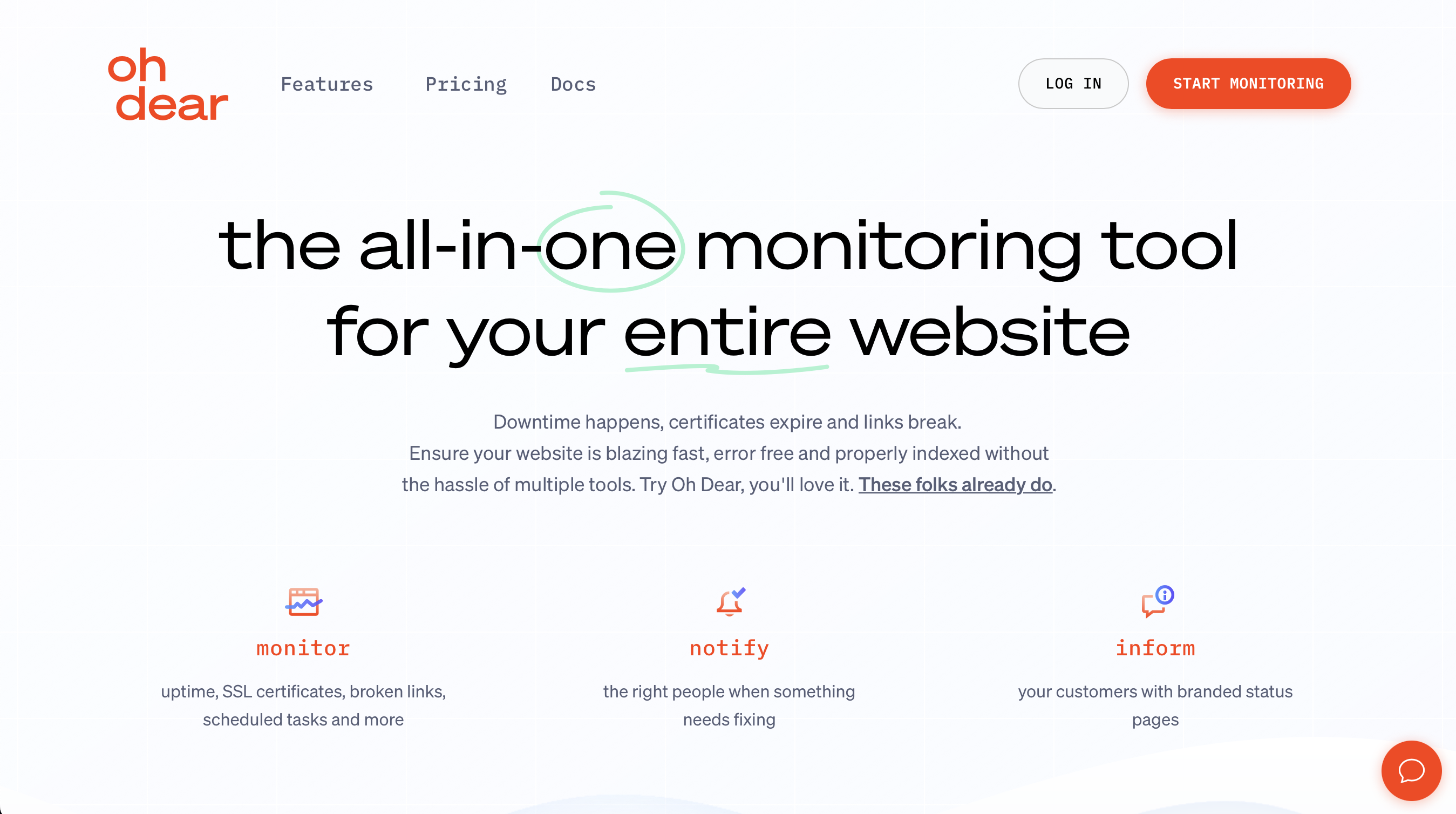
You can see that together with redesigning our site; we're also updating our logo.
On the redesigned homepage, there's a lot of content below the fold that's not shown in the screenshot above. We explain which features there are, show some testimonials and explain our pricing. Here are some more screenshots of the stuff below the fold.
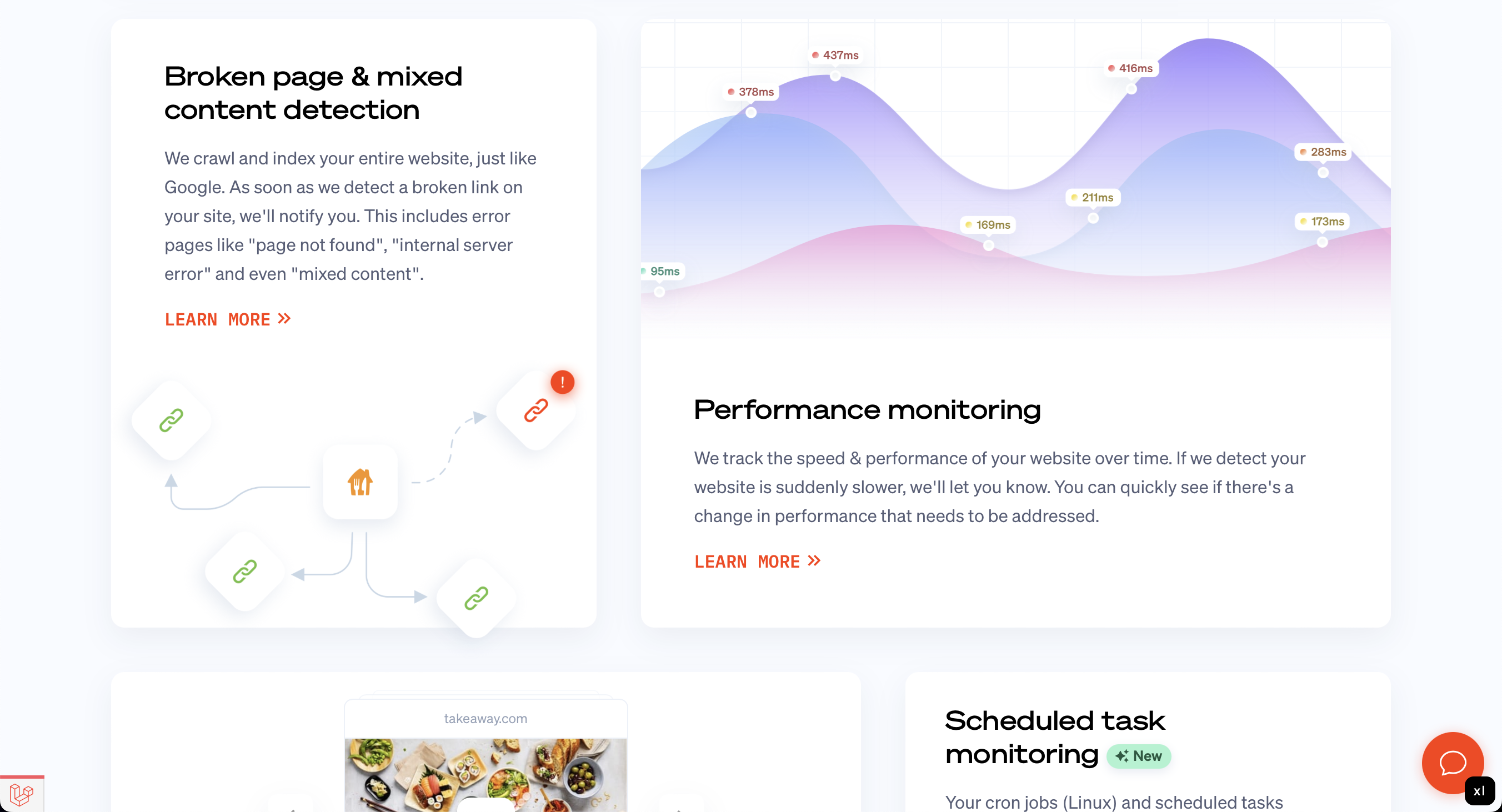
You can't see in these screenshots that there are a lot of subtle animations.
We're also updating our docs section. Here's what it currently looks like.
And here's what the redesigned docs look like.
This is just a small preview of the new marketing site. I hope it's clear that we're not just updating details but are rebuilding it from the ground up.
The Oh Dear application UI #
The public marketing pages are important for us as we hope they'll convince more people to use our service. But we didn't stop at the marketing site. We've also totally redesigning the app itself, solving long-standing usability issues in the process.
The sites list
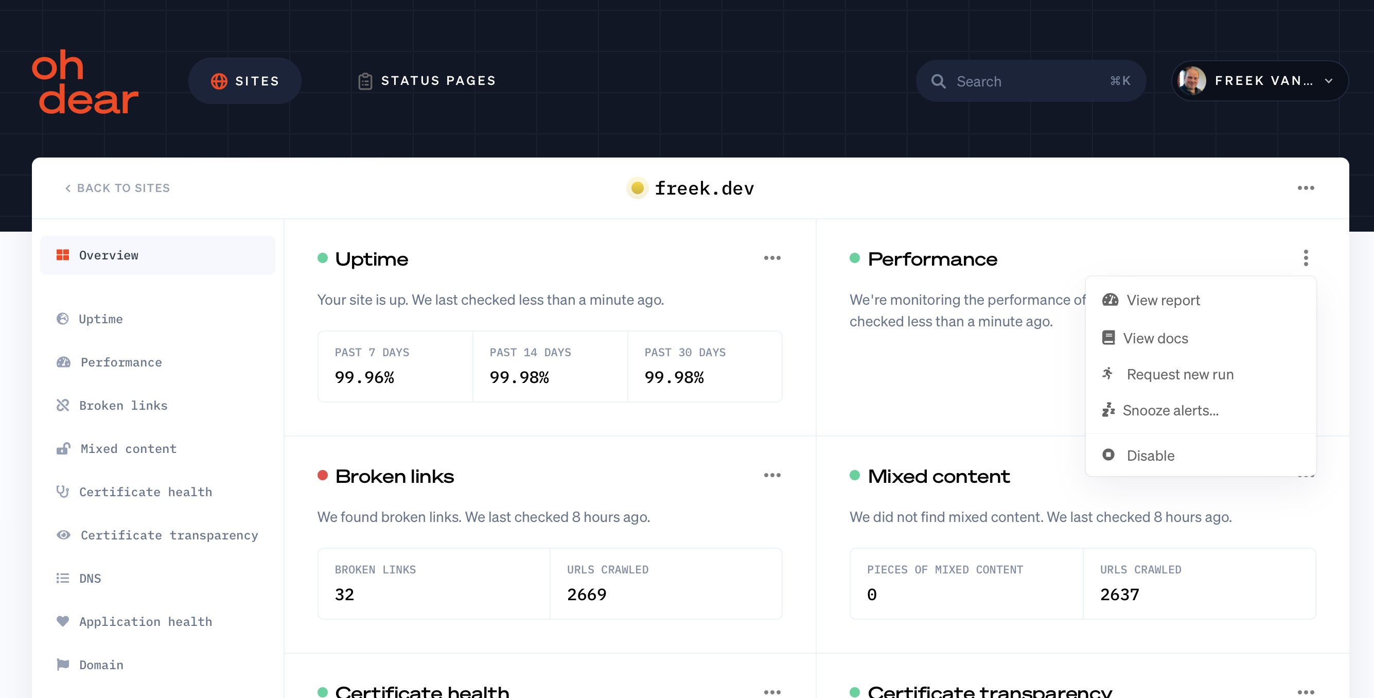
The current app UI is now almost five years old. We designed it when Oh Dear only offered its initial four checks. At the moment of writing, we offer nine checks. Here's what our current site list looks like.
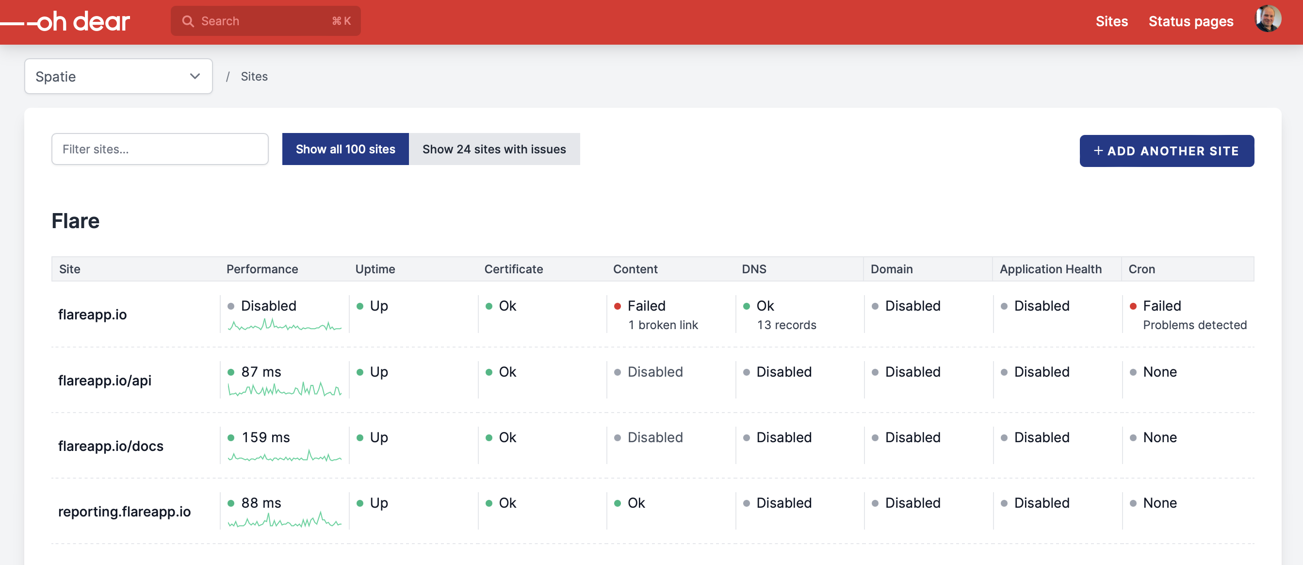
You can see that, with nine checks, it's a bit busy.
Here's what the redesigned list looks like. Don't mind those red dots at the performance checks, that's just because of seeded data.
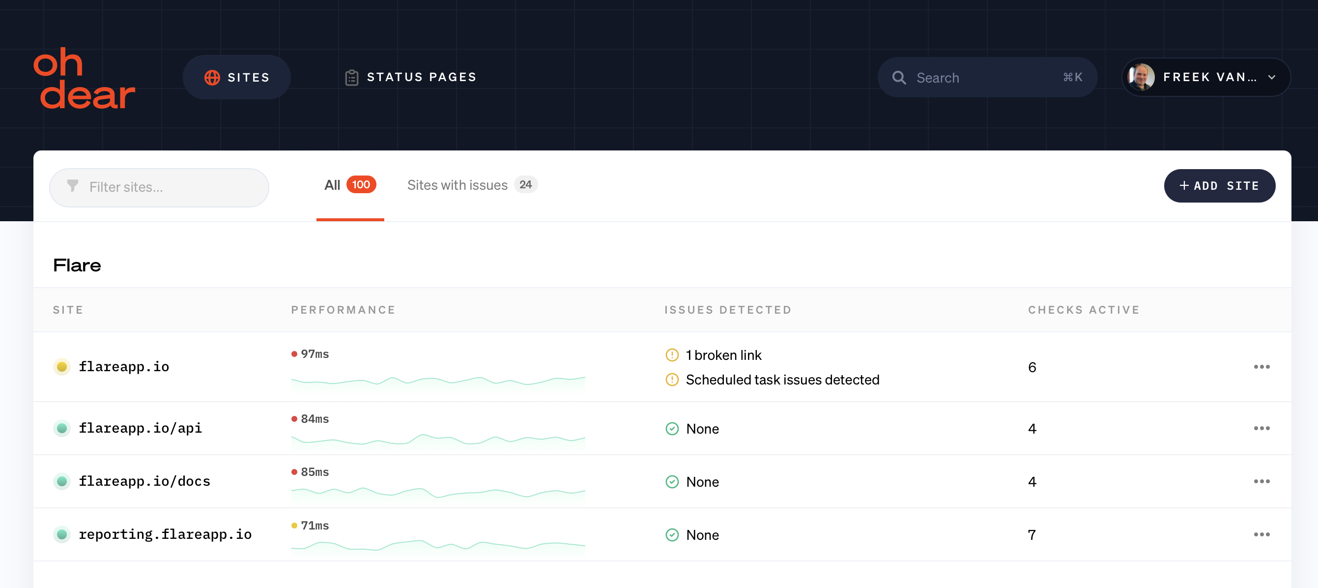
You can see that this list is much calmer. We only show the issues that we find. If no issues are found, the dot before the site will be green.
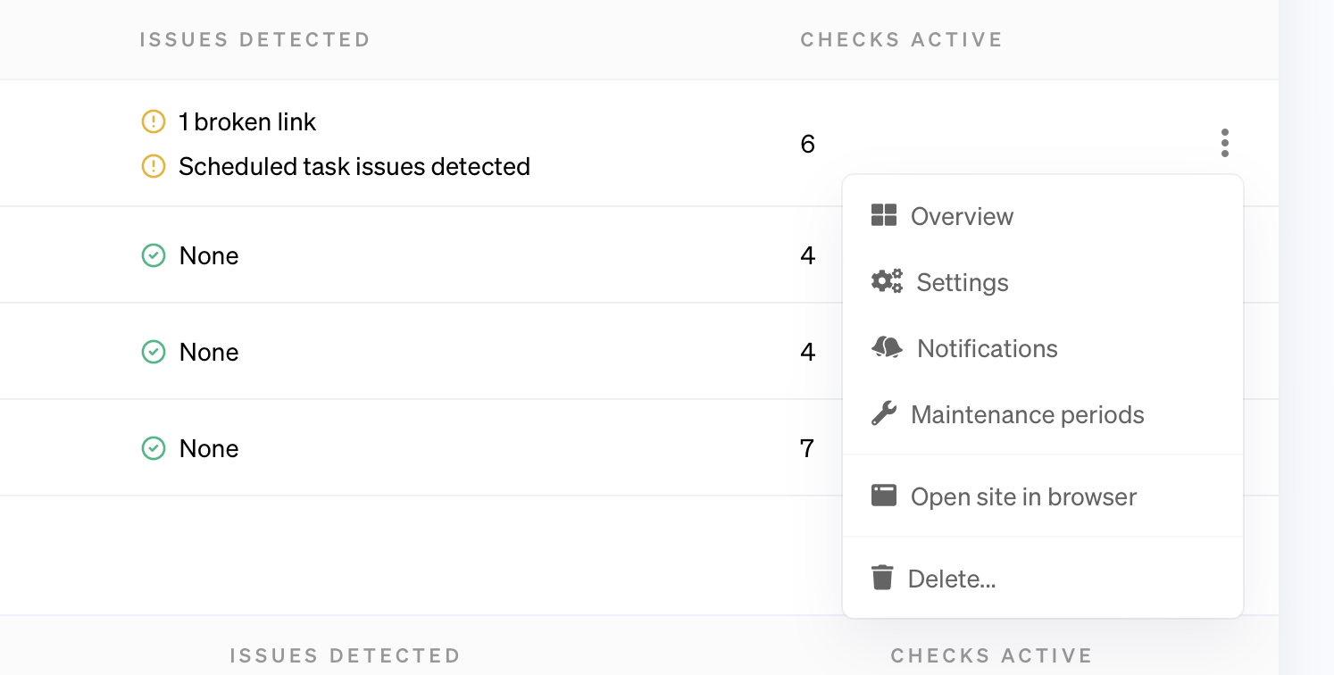
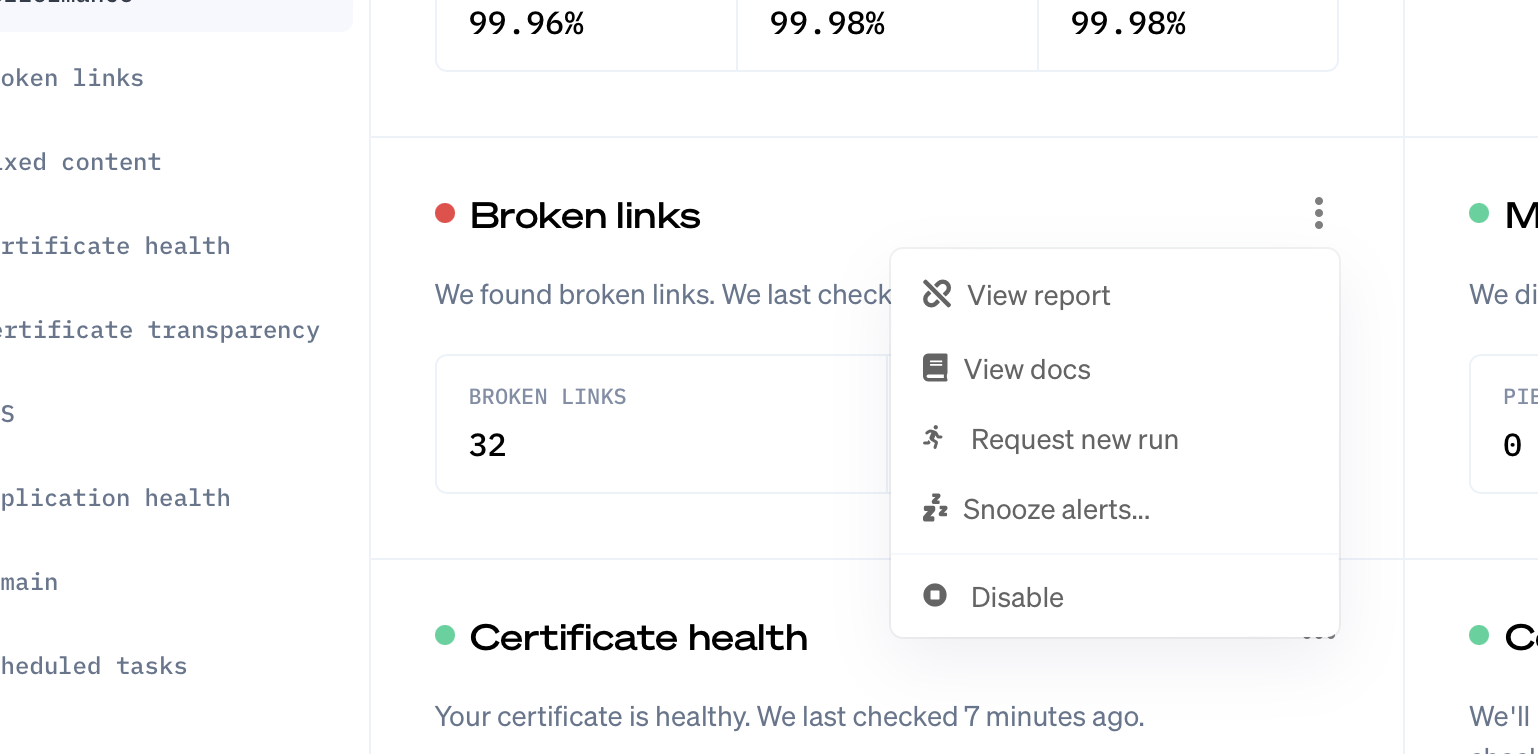
When you click those three dots at the end of a row, you'll see a little submenu that allows you to navigate to common pages for that site.
Let's take a look at the old site overview page.
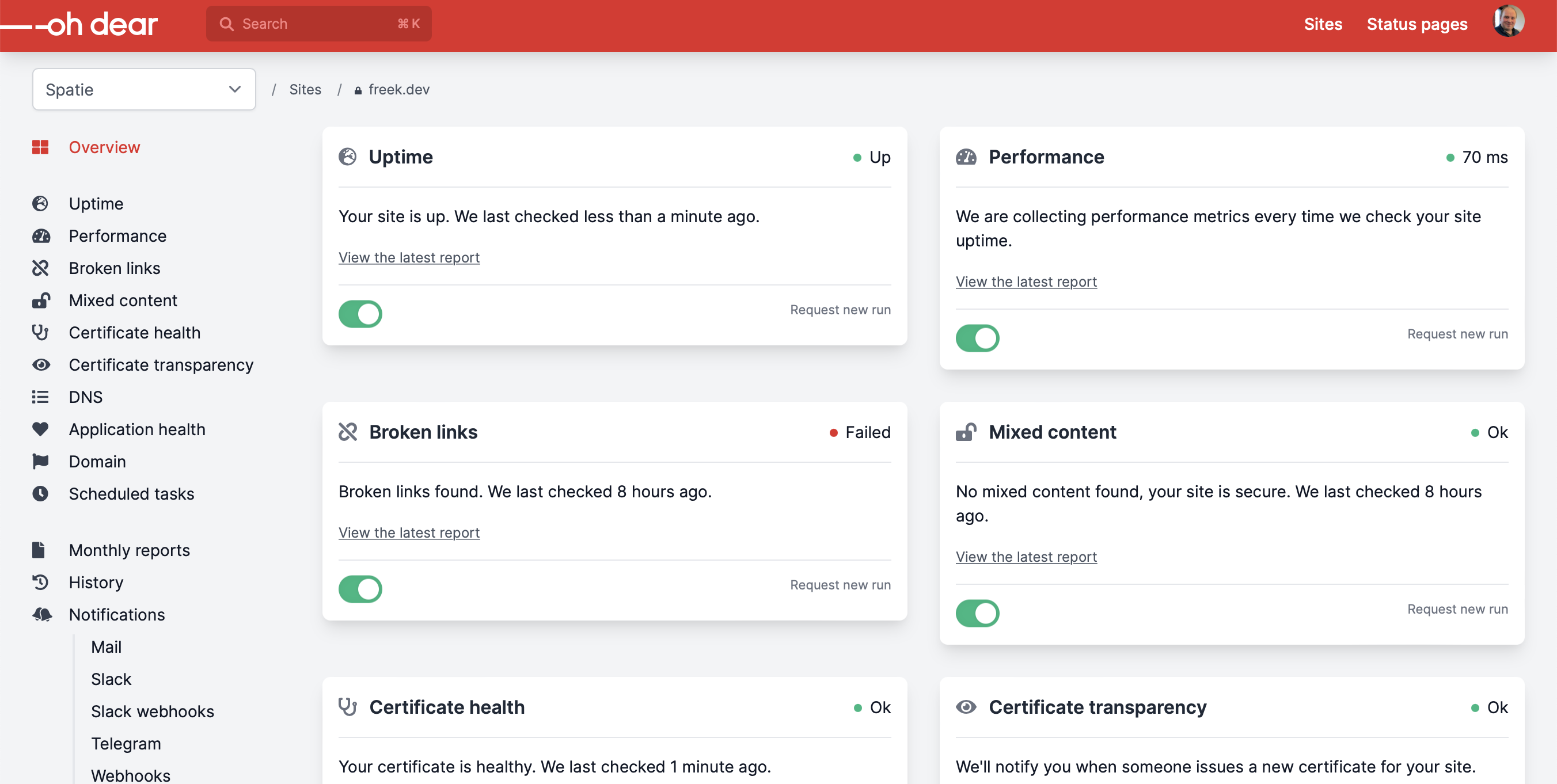
Not too bad, but it's much better in our redesign. We'll show a lot more helpful information by default.
Again, those three dots allow you to take relevant actions or pages for a check.
Notifications preferences
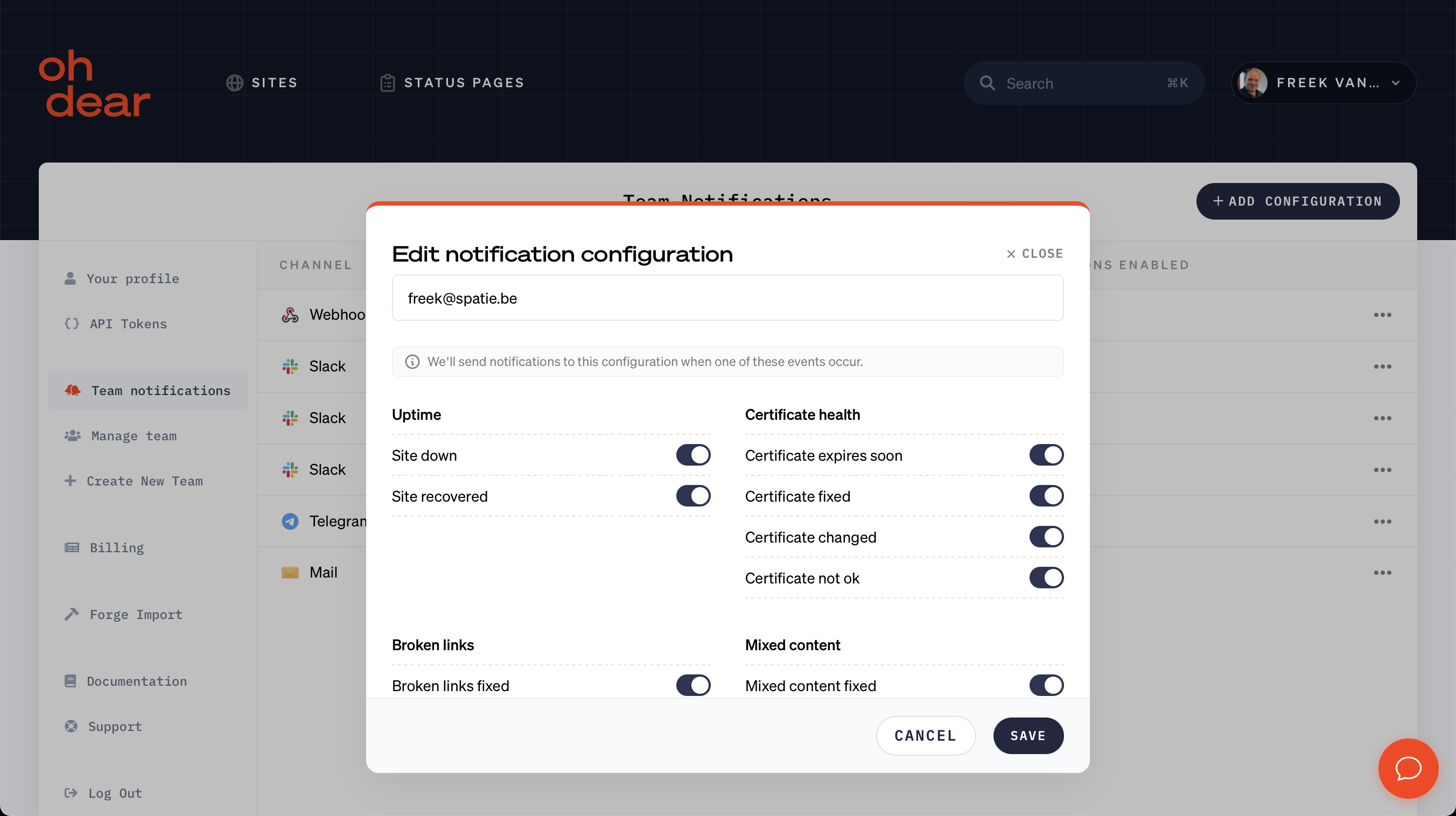
Let's go to another important part of our application. Oh Dear can send you notifications whenever we detect something wrong with your site. There are many notification channels: mail, Slack, Telegram, Discord, ... On the team notifications screen, you can configure for which events we should send on a particular channel.
Here's what the current screens look like. We have screens per channel, and on the list of a channel you can see all the possible notifications we can send.
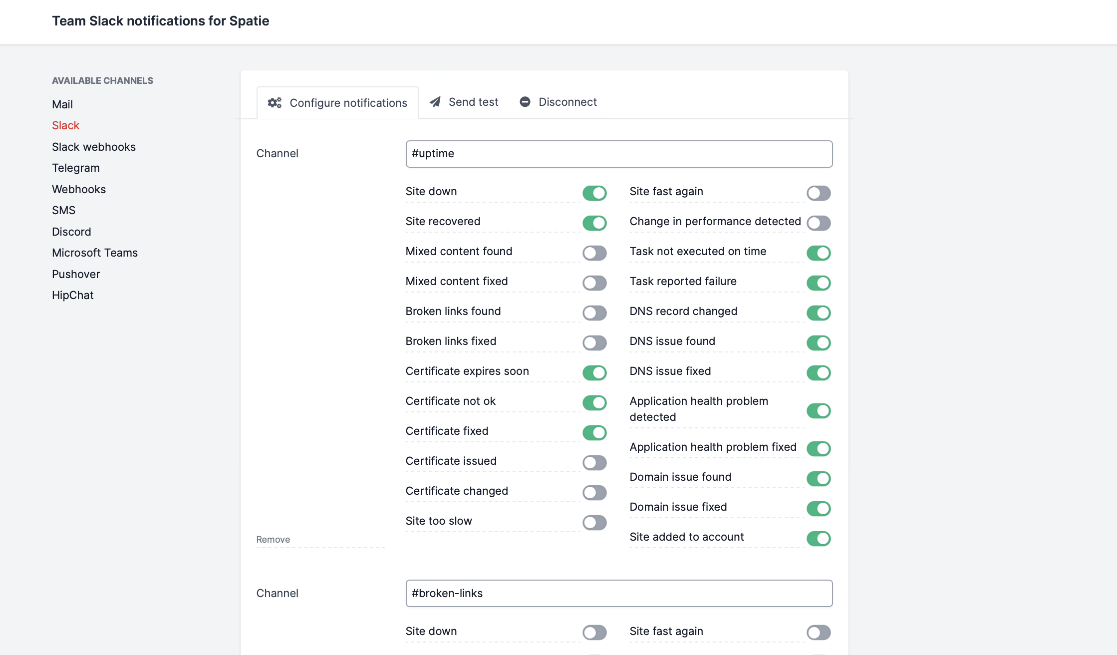
The problem with this setup is that it's hard to see which channels you have configured. To do that, you'll have to click "Mail", "Slack", "Discord", ... in the sidebar and check if you have something configured.
In the redesign, we've revamped this screen. Instead of screens per channel, we only have one screen that shows all notification configurations.
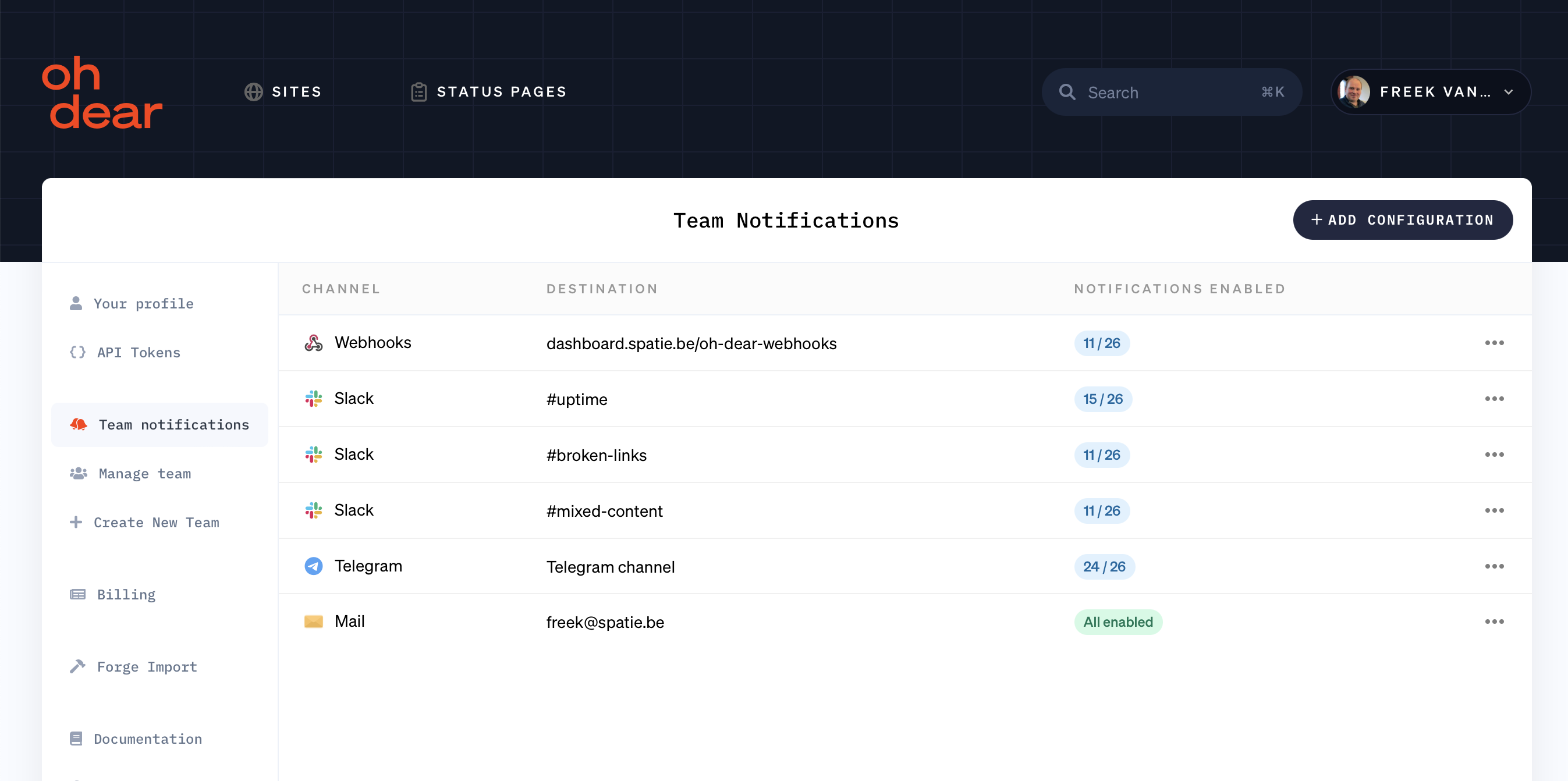
On the list we don't show all those notifications toggles anymore. Instead, we show how many notifications are configured for the channel. If you want to see which notifications, you can edit a configuration.
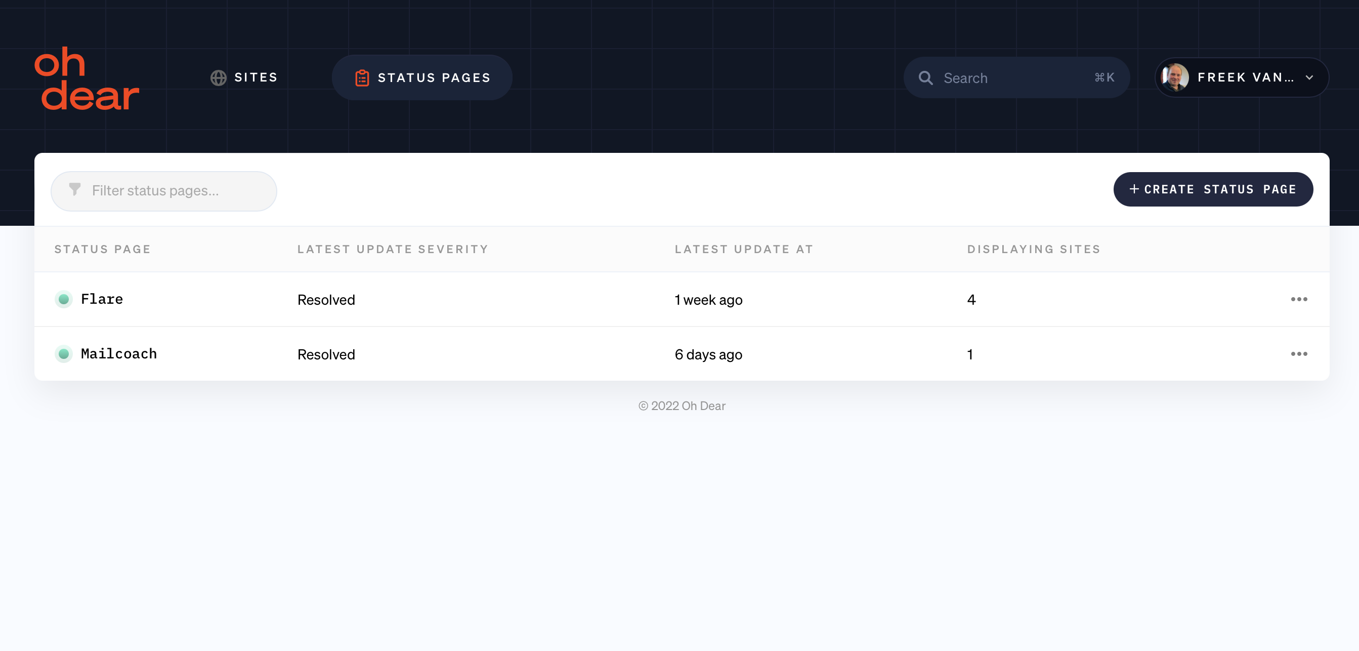
Configuring status pages
In addition to monitoring sites and applications, Oh Dear also offers beautiful status pages. The status pages allow you to communicate the health of your service to your audience. Here are some Oh Dear powered status pages for the Laravel organization and Flare.
We almost didn't dare to share a screenshot of how the UI now looks to set up a status page. It's kind of messy.
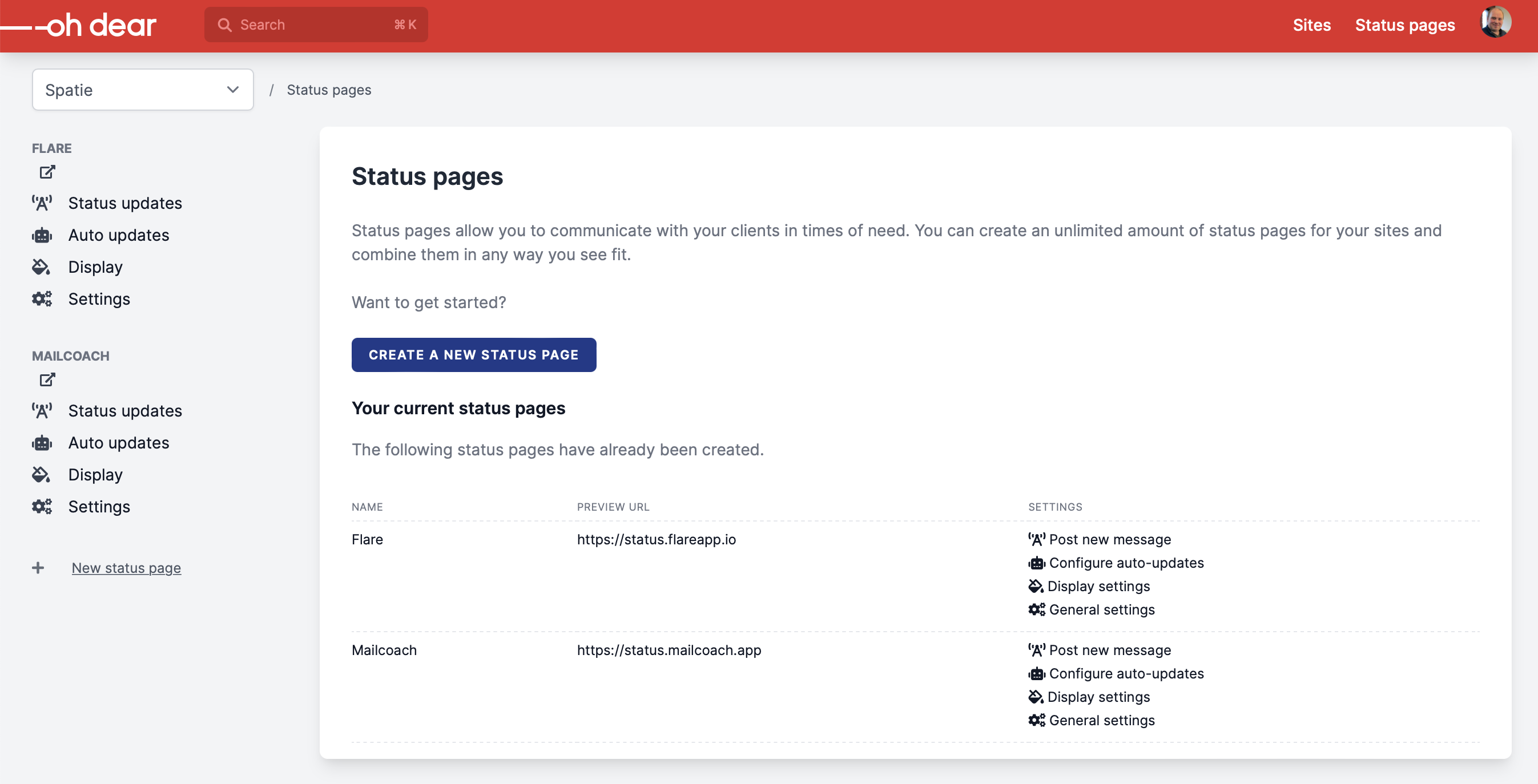
Sure, you can do a lot here, but it isn't pleasing to the eyes. In our redesign, we've vastly simplified this list. Here's what it looks like.
If you click on of the status pages, you'll see this status page overview.
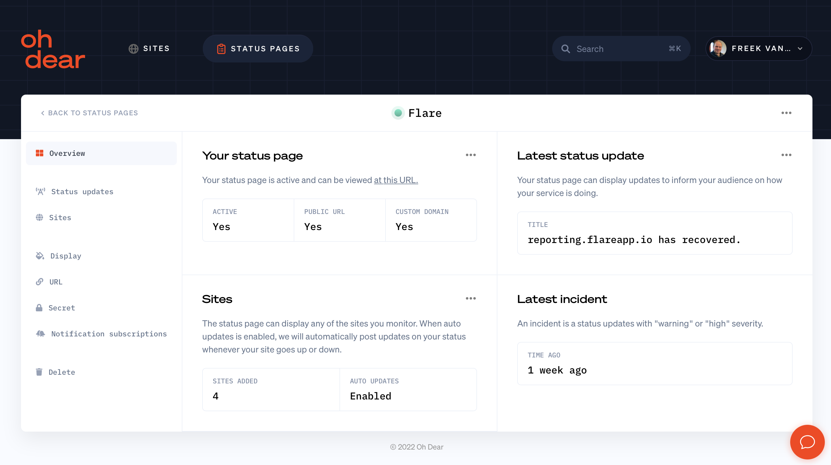
Notice how similar this all looks to the site list and site overview. This is a benefit to us: if you are already familiar with sites, you'll immediately feel at home when working with status pages.
In closing #
We hope that you liked this preview of our upcoming redesign. Currently, we're styling all of the separate settings screens. It's still a lot of work, but we'll get there. As mentioned above, we aim to launch this around end-of-September.
At that time, we'll also write some blog posts with technical details on the redesign. I can already share that we've built this using Laravel, Livewire, Alpine and Tailwind.
Oh Dear is the all-in-one monitoring tool for your entire website. Now is the perfect time to start monitoring your site using our ten-day free trial. When we launch our redesign, we'll also increase our prices. Old customers will always keep the current prices.
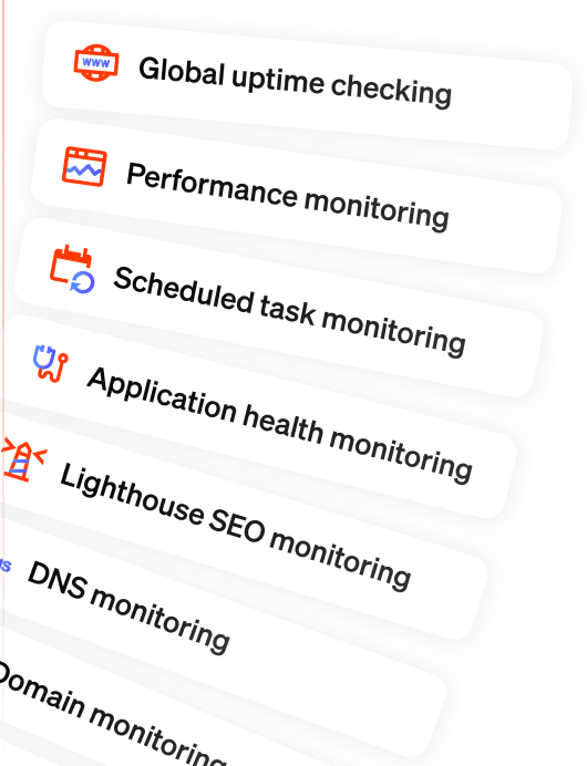
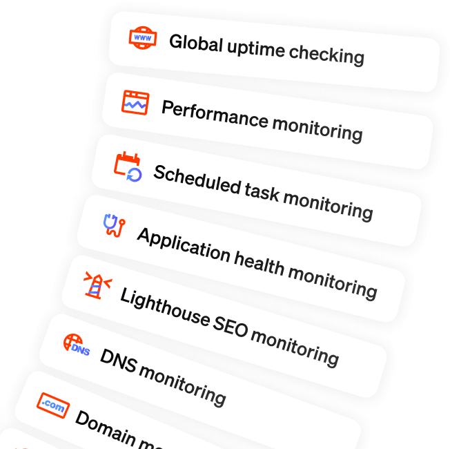
We monitor uptime, SSL certificates, broken links, scheduled tasks, application health, DNS, domain expiry and more. We send notifications when something's wrong. All that paired with a developer-friendly API and kick-ass documentation.