Building Oh Dear’s new design: Implementing the design
Published on May 6, 2022 by Nick Retel

In the previous blog post I gave an introduction about the project setup for the redesign of the new Oh Dear frontend. In this blog post I would like to show you how we are implementing the redesign of the Oh Dear frontend. Feel free to provide feedback on the design choices and statements made in this and future blog posts. We’d love to hear what you think of it.
It all started with Sketch #
Before we started the build process we had every page redesigned upfront by the talented team of DWY. They have been instructed to design something unique that would make Oh Dear look and feel next level. We think they did a perfect job. The result was a Sketch file containing approximately 25 pixel perfect page designs. Each containing about 5 to 10 sections that exist out of multiple components and unique design elements.
This resulted in approximately 100 components to be build. Many of those components contain a unique visual sub-component which ideally should become interactive in many cases.
That’s not all, besides light mode all pages should also support dark mode and of course look perfect and be interactive on any screen size. It’s lot of work but nevertheless very exciting to see if we can pull it off!
Setting up the project #
After setting up the project we started scaffolding the page layouts one by one. We had to decide with which one to start. We chose to start with the most complex page, the homepage. The idea behind this was that we had to overcome the hardest challenges first. By doing the hard things first we would gain knowledge on how each component could be structured best, making the lesser complex pages easier to build.
Using the traditional approach
Each page has the traditional setup of a base layout, a header, a main and a footer section. All public facing pages use the same base layout. They are built with blade, and are structured through blade components as much as possible. Therefore our base layout is located in views/components/front/layout as index.blade.php. This allows us to start each page with <x-front.layout>.
a note: the
front folder contains all public facing components. We also have an app folder which contains all application frontend components. You can read more about this in our previous blog post.
The base layout contains two sub components a <x-front.layout.header> and <x-front.layout.footer> with a $slot variable in between. Resulting in something like this:
<!DOCTYPE html>
<html lang="en">
	<head>
	... head tags
	</head>
<body>
	<x-front.layout.header>

	{{$slot}}

	<x-front.layout.footer>
</body>
Using blade components
The result of using this approach combined with blade components is a very clean markup which makes it perfect for reuse. For example this is how the homepage is structured:
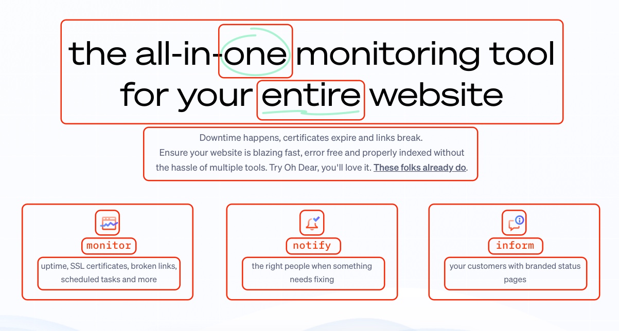
<x-front.layout
    title="Oh Dear - The all-in-one monitoring tool for your entire website"
>
	<x-slot name="header">
		... all custom header things specific to the homepage
	</x-slot>

	<!-- homepage sections -->
	...

</x-front.layout>
Blade components and slots provide handy means to customise the components for each specific use case. Note the title attribute which sets the <title> within the base layout. Or the header slot which we use to add specific markup for the hero section of the homepage.
Lets build #
Now we have the basics covered it was time to start building. But how do you approach building 25 pages consisting of 100 components. Well, you do it one bit at a time. Before we started with the pages we built the base layout, including the header and the footer first.
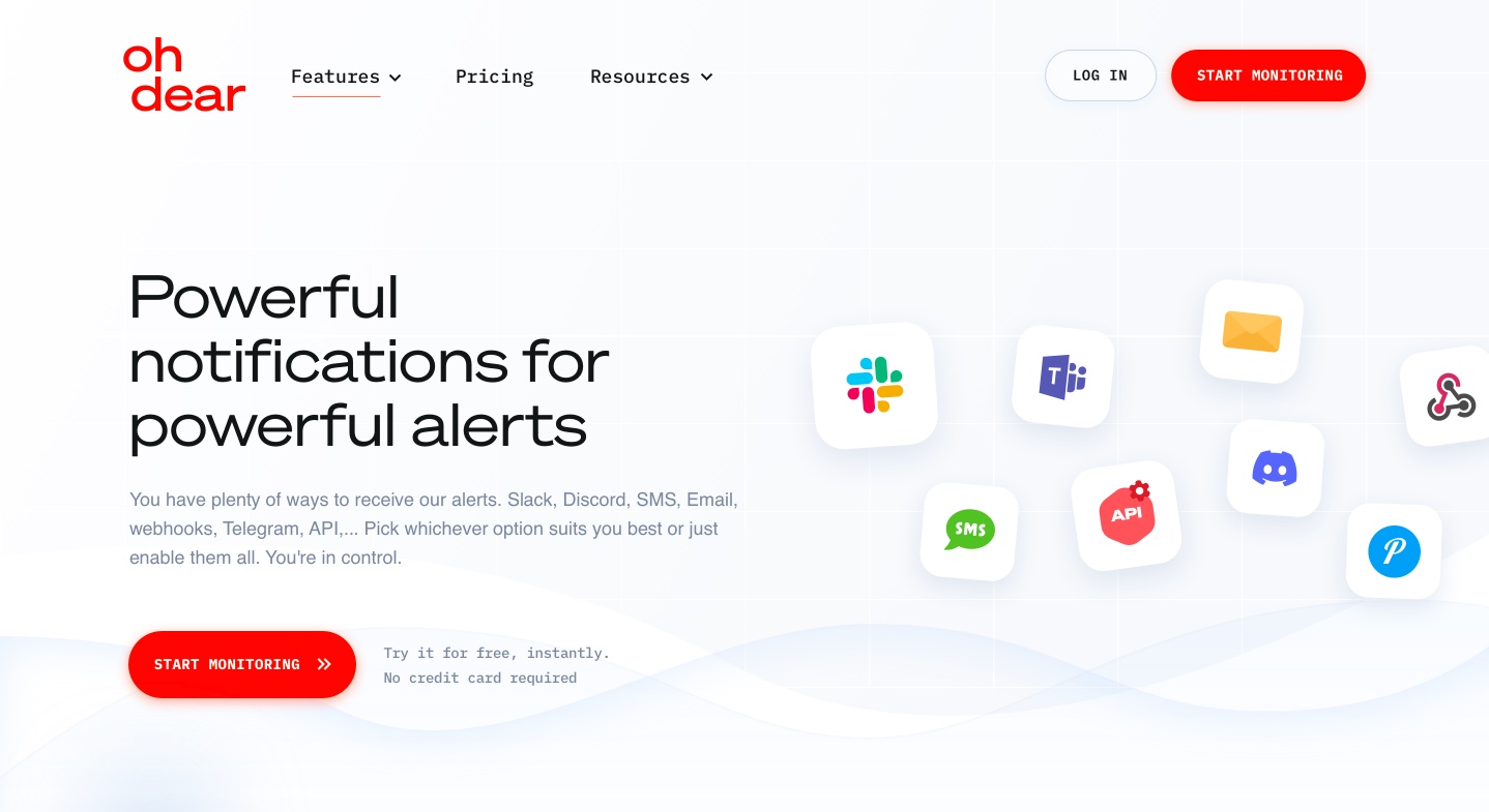
Next we started with the homepage. We first determined the homepage sections:
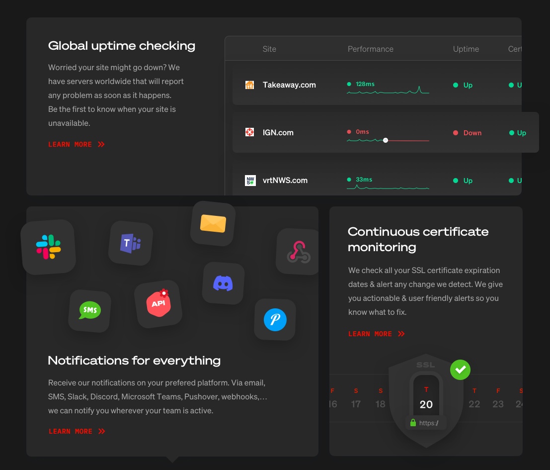
Next, we took the first section and split that section into smaller components:
We then start building the components one by one. Building each component goes through several stages. They basically come down to:
1. Deconstruct the design
First we need to understand the design before we can build it. For us it meant diving into the Sketch file and checkout all layers and their properties like colours, fonts and font sizes. Once we identified the ingredients we continued with the markup.
2. Start building
Next we replicate each layer and its properties. We write the markup and style it at same time thanks to Tailwind CSS. This combined with Browsersync or a tool like Sizzy is seeing magic happening in front of you.
It allows us to have the design, the code and the end result in front of us without having to toggle between windows or files too much.
3. Refine
When having built a specific section we constantly refine them which basically means repeating step 1 and 2 up to a point where the end result matches the design.
4. Add interactivity
We try to go the next mile by adding interactivity to many components. As we build most visuals in html we can make them interactive with Javascript. To make our lives a lot easier we use help of AlpineJS.
AlpineJS fits perfectly with the strategy of using blade components as much as possible. For example on the homepage we have this counter component:
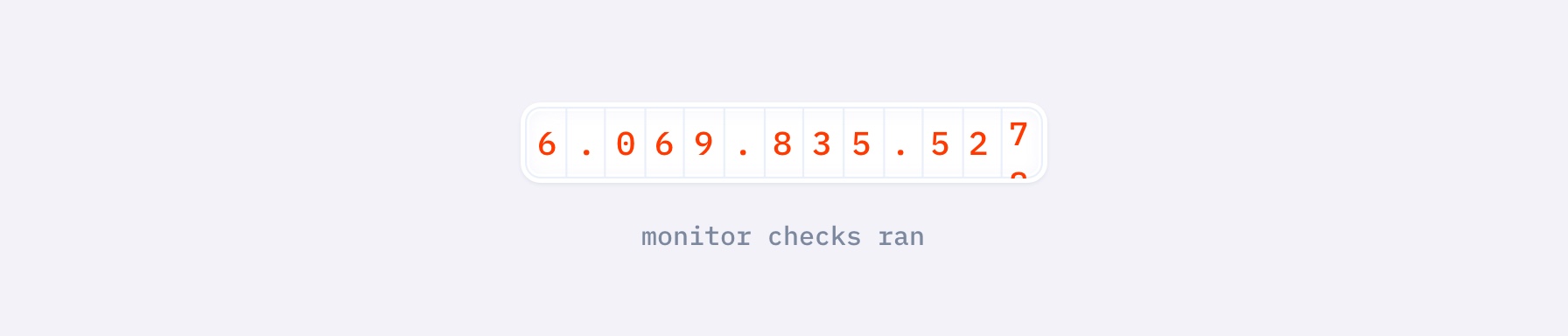
Of which the markup in home.blade.php looks like:
<x-front.home.counter :count="$publicMetrics['runCount']" />
We often pass an initial values via the component attributes to reuse them in the component itself.
When we take a look at the counter component it is structured as follows:
<div x-data="counter">
	... all counter markup
</div>

@once
    @push('scripts')
        <script>
            document.addEventListener('alpine:init', () => {
                Alpine.data('counter' => ({
                    count: {{ $count }},
                    digits: [],
                    init() {
                        this.recalculateDigits();
                        setInterval(() => {
                            fetch('/api/public-metrics')
                                .then(response => response.json())
                                .then((data) => {
                                    let key = `${this.type}_count`
                                    this.count = data[key];
                                });
                        }, 5000);
                    },
                }));
            });
        </script>
    @endpush
@endonce
As you can see we set the x-data property to what is defined below the markup. We create a specific script which is scoped to this component. This setup allows us to set initial values and get it all going in the init() hook. In this case it fetches an API endpoint every five seconds and updates the count.
By using this approach together with toggling tailwind classes we can create slick animations and add interactivity. Big shoutout to Seb who initially set up this structure as well as the whole redesign structure. It turned out to be very effective for all other components as well.
5. Make it responsive
We often build the design for the desktop viewport first. The reason we don’t develop mobile first (which is a popular approach) is because the designs have been made (mostly) for desktop only. So in many cases we don’t know upfront what the mobile version should look like of a specific page. Therefore making the desktop version first and then see what needs to be adjusted when making the browser smaller is a better approach.
Rinse and repeat #
When having a specific component or section built we then cleaned it up as much as possible. Refine the code, cleanup any log statements, rename variables and components if needed. Then we just repeat the whole process for the next section or component.
Using components and make them easy to work with #
As mentioned before, working with components can cleanup your markup a lot. Another benefit of using components is its flexibility. For example variables within a component can be either populated through setting the attribute on the parent, like so:
<!-- counter component -->
<div>
	{{ $counter }}
</div>
Use it like: <x-counter count="12" />
Or you can add specific markup within the component tag:
<x-counter>
	<x-slot:count>
		<span class="text-white font-mono">12</span> notifications
	</x-slot>
<x-counter>
This comes in very handy for components that must show a description. In some cases the description can be a single paragraph. It can then be passed to the component as follows:
<x-feature-highlight
	title="Have piece of mind"
	subtitle="that things are running smooth"
	description="This is what your dashboard looks like when all your websites are up. Oh Dear is running checks every minute, so you can sleep on both ears. Happy days!
/>
However, we can’t use this approach if we need to pass more than one paragraph and expect it to look good in the browser.
We can then do:
<x-feature-highlight
	title="Have piece of mind"
	subtitle="that things are running smooth"
>
	<x-slot:description>
		<p>This is what your dashboard looks like when all your websites are up. Oh Dear is running checks every minute, so you can sleep on both ears. Happy days!</p>

		<p>Another paragraph can go here</p>
	</x-slot>
<x-counter>
In conclusion #
Implementing the design has been challenging, but having a process like described above felt being key in what we completed so far.
The homepage, the docs and almost all feature pages have been completed. So far there are 71,307 lines to be added to the main branch while we still need to start with the work the app side. We’ve done a crazy amount of work and yet there is still a lot to be done.
We keep on building and aim to provide our users with a renewed kick-ass product somewhere this year. Would you like to see more frequent product updates make sure to follow us on Twitter.
Check out the next post in this series on why and how we created a color sytem.