A fresh new look for Oh Dear
Published on February 25, 2020 by Mattias Geniar
We're super proud to show the new us - we have a brand new logo, an entirely new style and a new website. In this post, we'll show you all the changes!
A rename of Oh Dear #
As part of our change, we're making a tiny change to our name: we are no longer "Oh Dear!" but are now "Oh Dear". No more exclamation point at the end.
The reason is perhaps even more boring than the name change itself: it's super hard to write good content when it looks like, every time you mention Oh Dear!, the sentence stopped midway. See? Super confusing. Let's stop doing that.
A brand new logo #
Our previous logo, while original, had sort of lost its appeal to us. We'll miss our British monocle-wearing friend, but couldn' be happier with our newly updated logo.
For old times' sake, here he is one more time. Enjoy your time off, buddy.

For our new logo, we partnered with Rik Grafiek, a creative from Ghent, Belgium.
Our new look is clean, professional and modern - with lots going on behind the scenes.

If you have to explain a logo, it isn't a good one. We hope you'll notice the following accents in our new style:
- It looks like a cardiac flatline - that's when we spring to live and start sending alerts ?
- The "o" in Oh Dear is a magnifying glass, because we look for broken links and other flaws in your sites ?
With a new logo also comes a new avatar for use in social media & our notifications.
![]()
You'll find a subtle reference to the wink of our old monocle-wearing friend. ?
Refreshing our postcards as well #
Every new client of Oh Dear automatically gets a postcard sent to their address, as a special thank you for trusting us with the important task of monitoring your websites.
Our new look & feel also allowed us to rethink our postcards. Left you'll find our old postcard, to the right our new one.
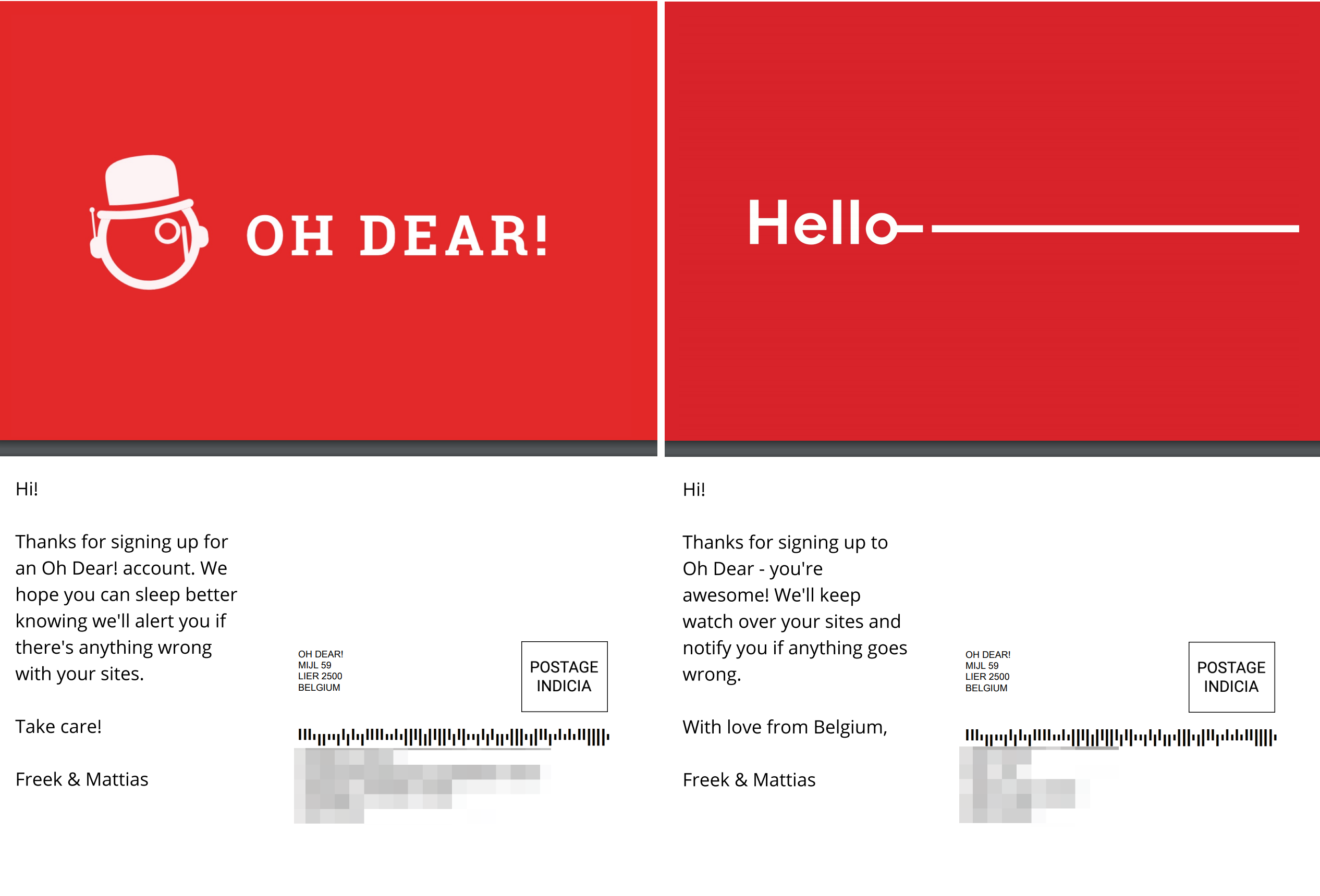
The new cards have an adapted version of our logo as the front cover.
These are true collectors' items. The only way to get one, is to sign up and become an Oh Dear user. ?
The new look & feel of the website #
The homepage got a very slick new feel to it.
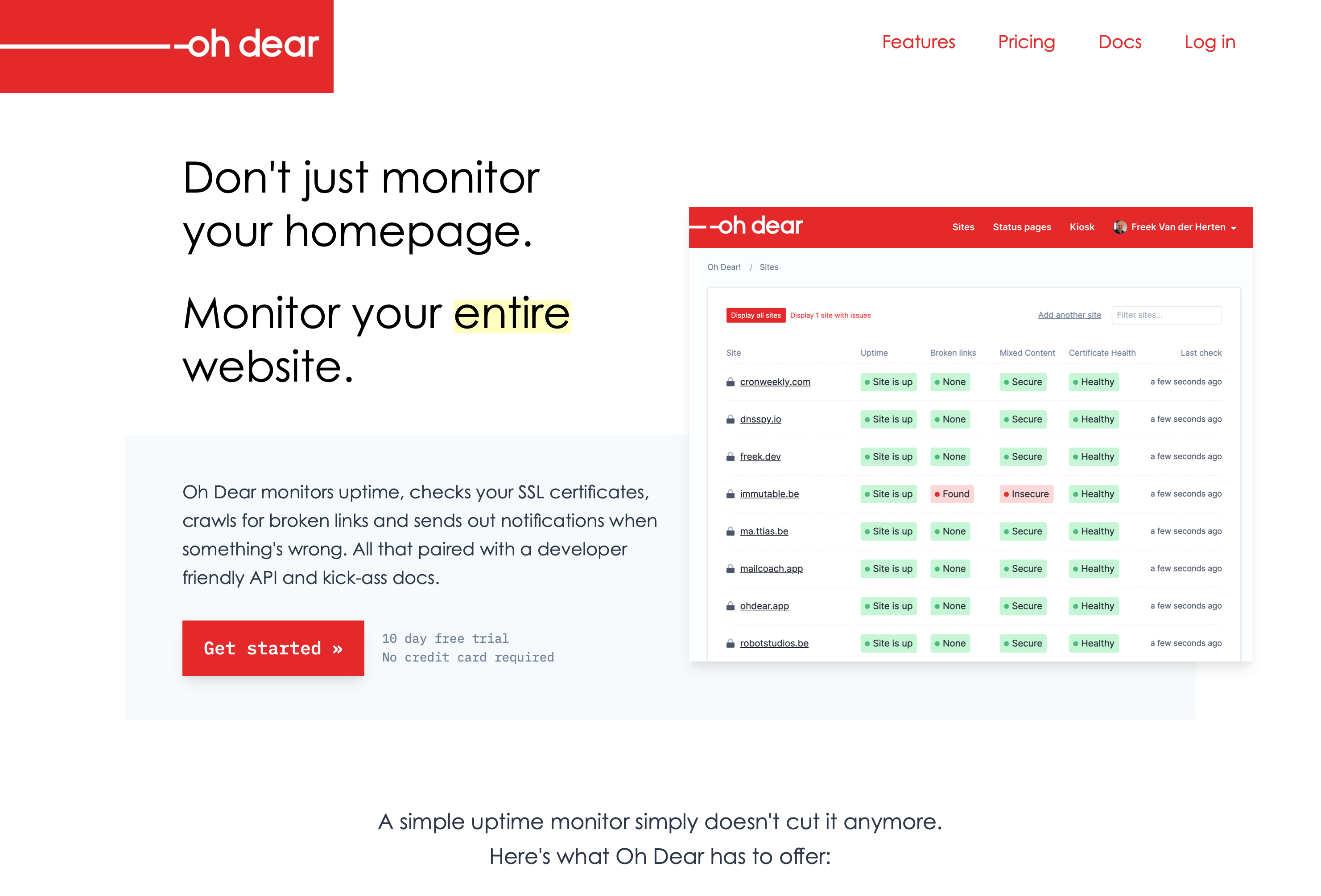
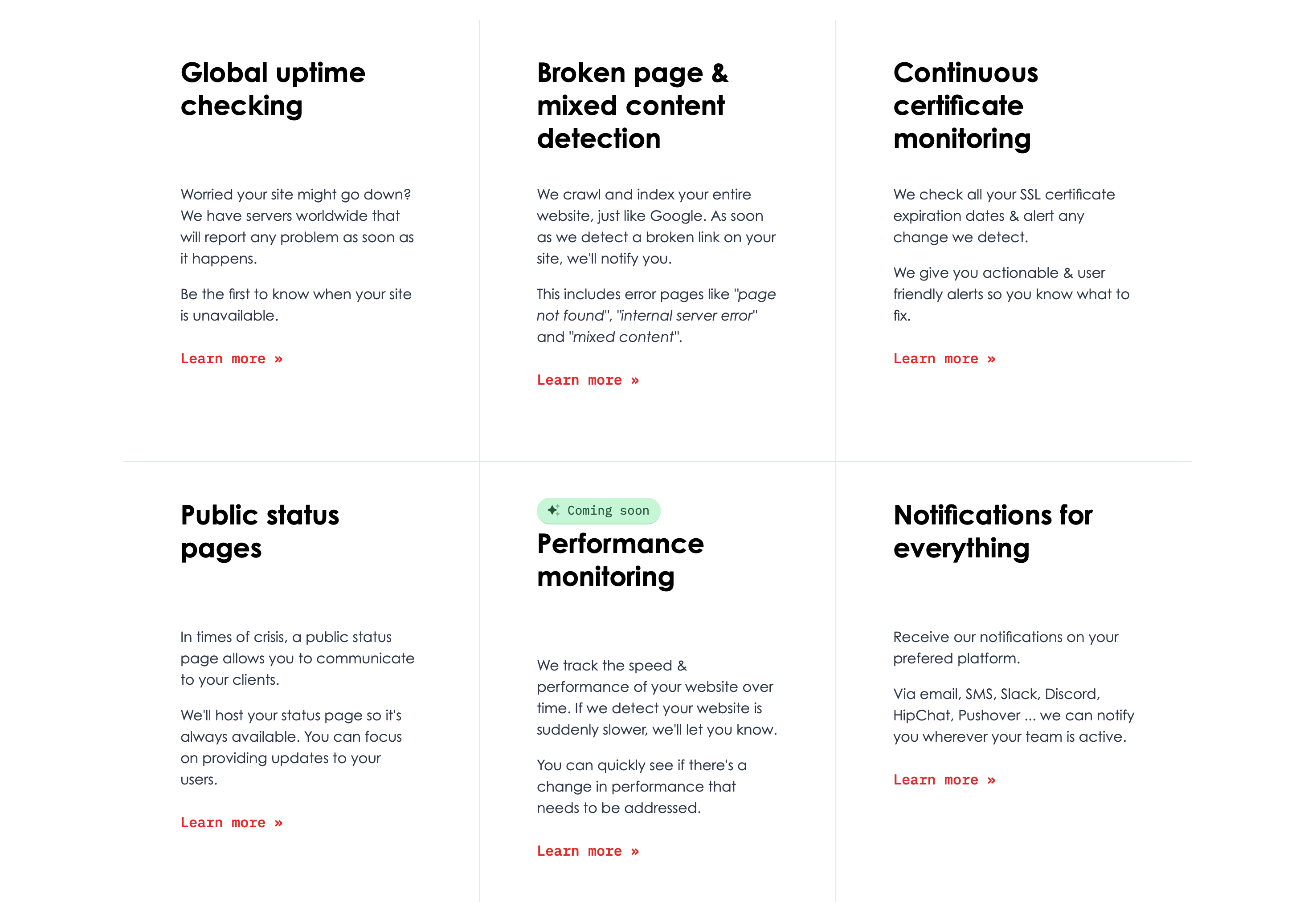
Our website has changed a lot over the 3 years we've been in business. From left to right, these were the designs in 2017, 2018 and now in 2020.

For a live version of our new design, have a look at our homepage.
We've been adding more and more whitespace with every iteration. It's given us a tighter design and an overall increase in professionalisme to the website.
At least, we feel we've added professionalism - we can always agree to disagree. ?
Updated documentation layout #
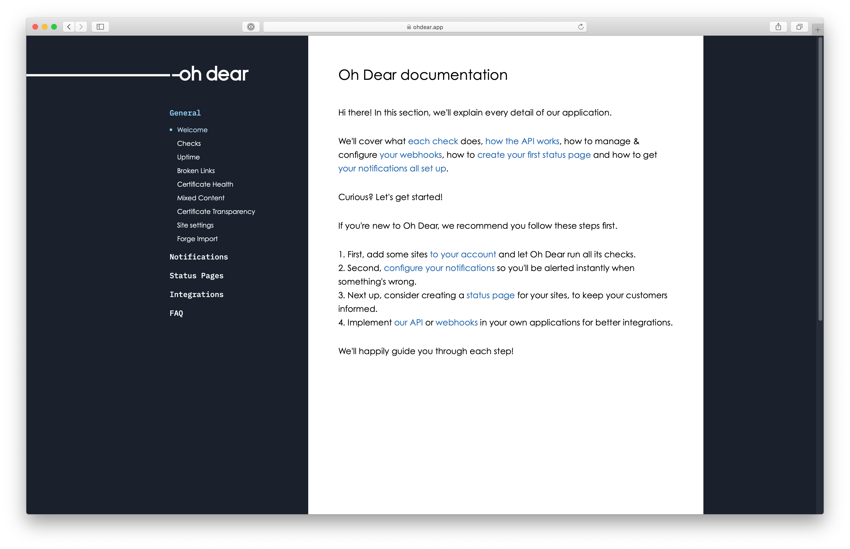
Our documentation section is easily the biggest content-part of our website.
Every check we perform is documented, we have code examples for interacting with our API, there are PHP packages for working with our webhooks, ... All this to say, our docs are pretty big.
From now on, they'll be visually different from our main website too. They deserve a little something, don't they?
New stickers are coming! #
We'll be handing these out at conferences like candy, if you want one - make sure to talk to Freek or Mattias!
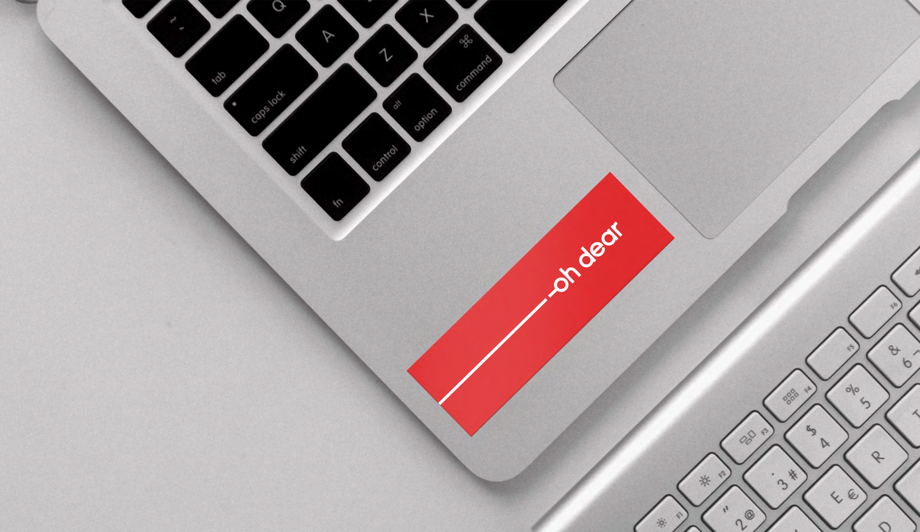
Now that we have a professional brand & style guide, we also have name tags and some other ideas for branded gear to hand out.
To celebrate, we're giving away a year worth of monitoring services! #
Because we're thrilled about this update, we want to share our enthousiasm with the rest of the world!
We're giving away a year worth of monitoring for free to one lucky winner in the contest. To enter the Oh Dear giveaway, complete the form right there. ?
What do you think? #
We'd love to hear feedback!
Do you like the new design? If not, what bothers you? Do you still see places where we refer to our old logo instead of the new one? Do let us know!


