A fresh new dashboard look!
Published on November 27, 2020 by Mattias Geniar
We just launched our brand new monitoring dashboard to all clients, giving a modern new look & feel to Oh Dear! There are plenty of improvements under the hood, so let's dive right in.
A fresh new dashboard #
Here's what the new dashboard looks like.
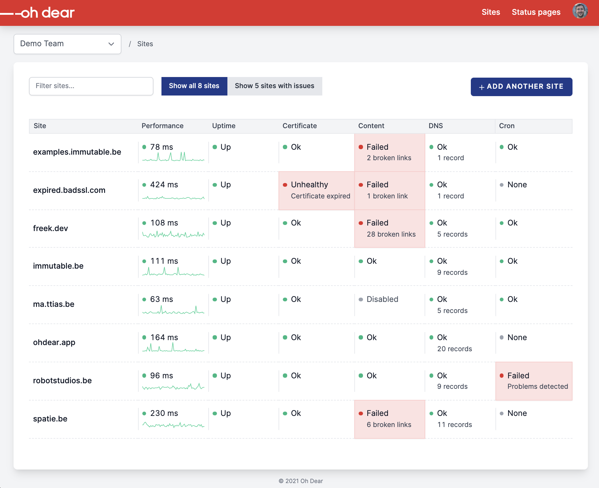
As usual, it auto-refreshes every 5 seconds (through the power of Laravel Livewire, which Freek wrote about here and here).
Pretty clean, right? 🙏
If we compare it to our previous dashboard, this one suddenly feels very ... old & bulky.
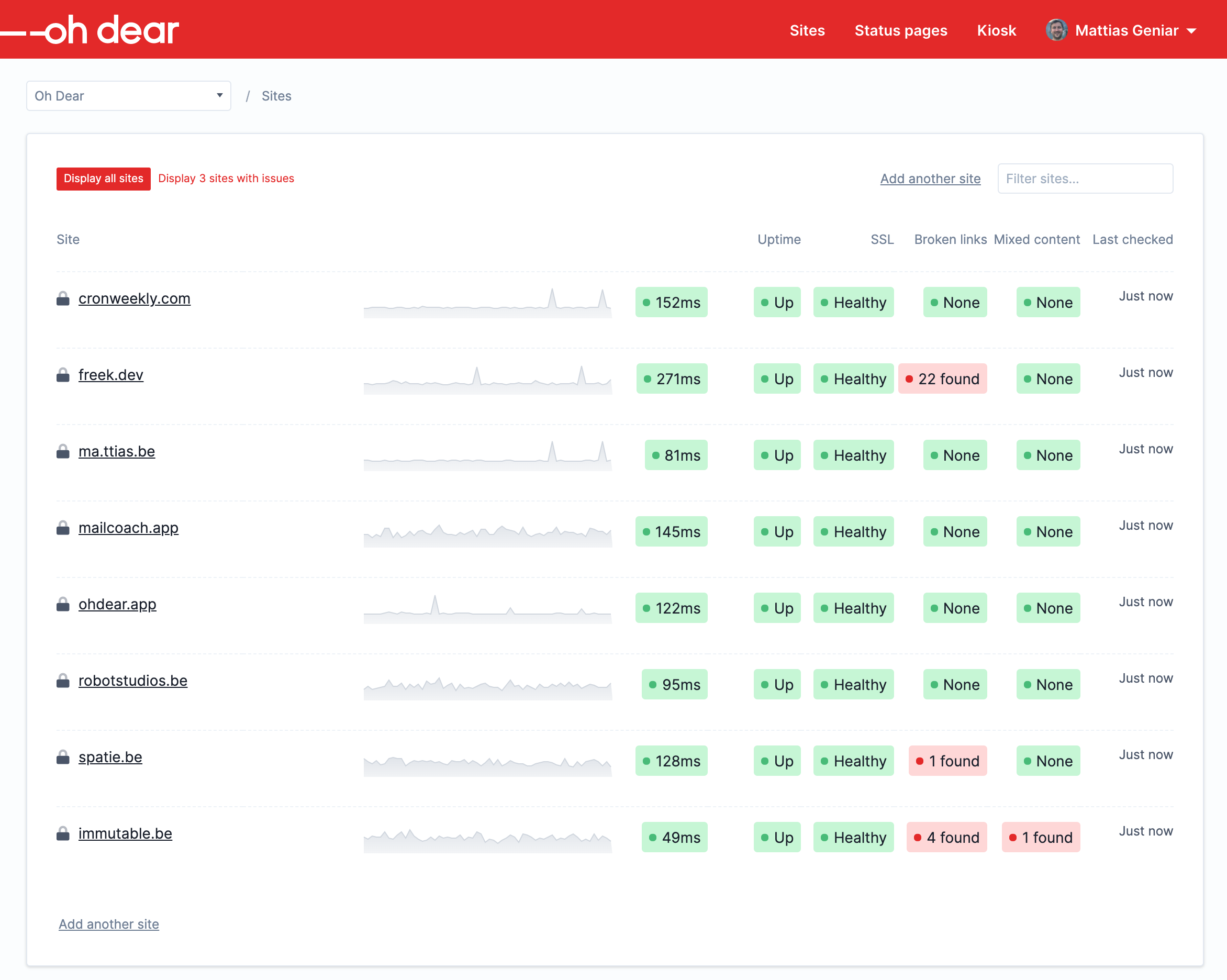
We hope you'll get used to the new design as quickly as we did!
More information at your fingertips #
This modern new look gives you a lot of information directly on the dashboard. In many cases, there's no need to click through anymore to see the reason of the alert.
Take this downtime alert for instance.

Or this SSL certificate warning.

Or these content warnings, which consist of both broken links & mixed content checking.

A summarized view of the error is available right there.
Of course, you can always click the entire cell and be taken to a more detailed view, with all the bells & whistles you know.
Modern touches everywhere! #
Overall, the entire layout got a welcome refresher. A slightly darker background, tighter spacings around all elements and some more explicit hover states for our navigations.
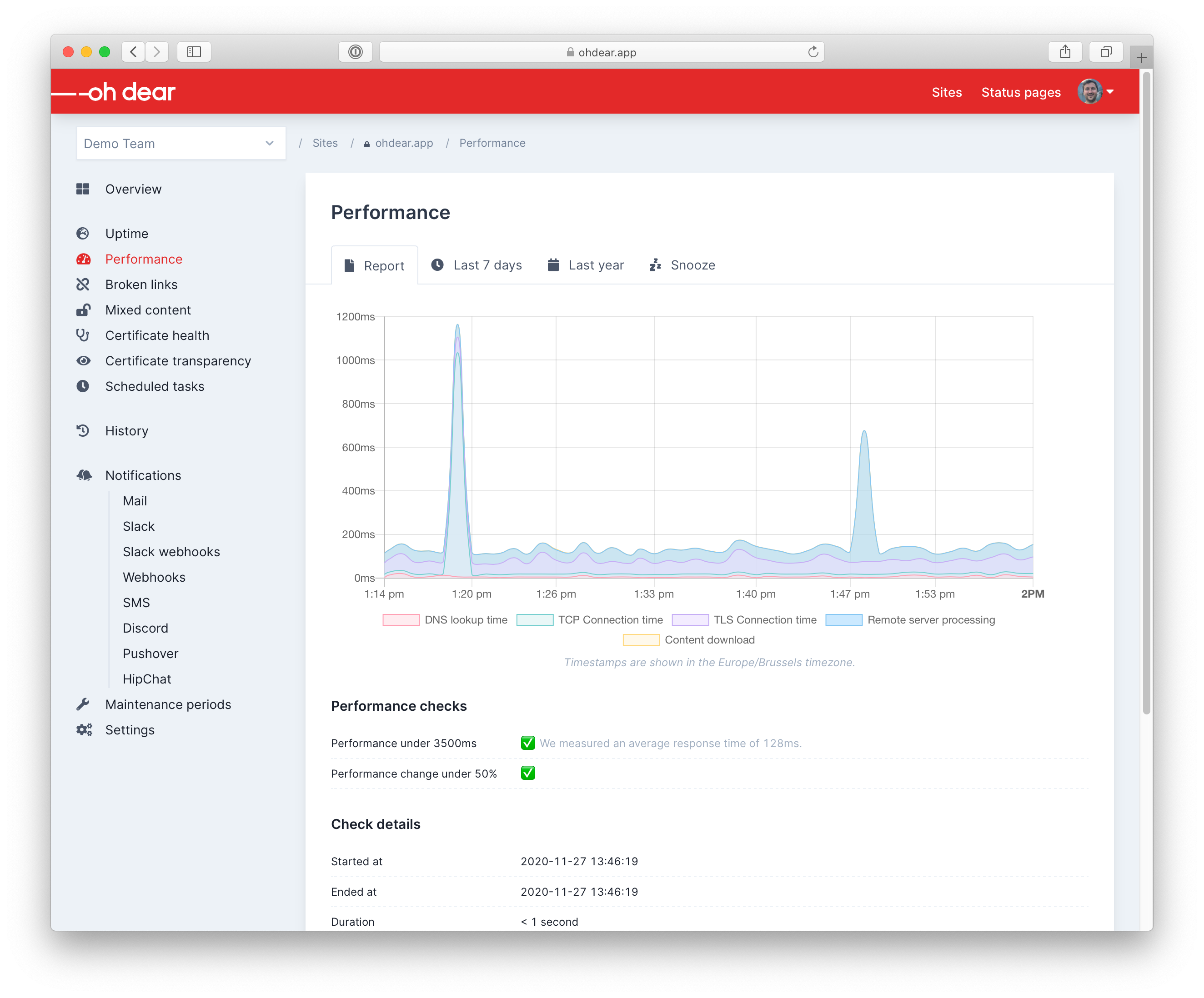
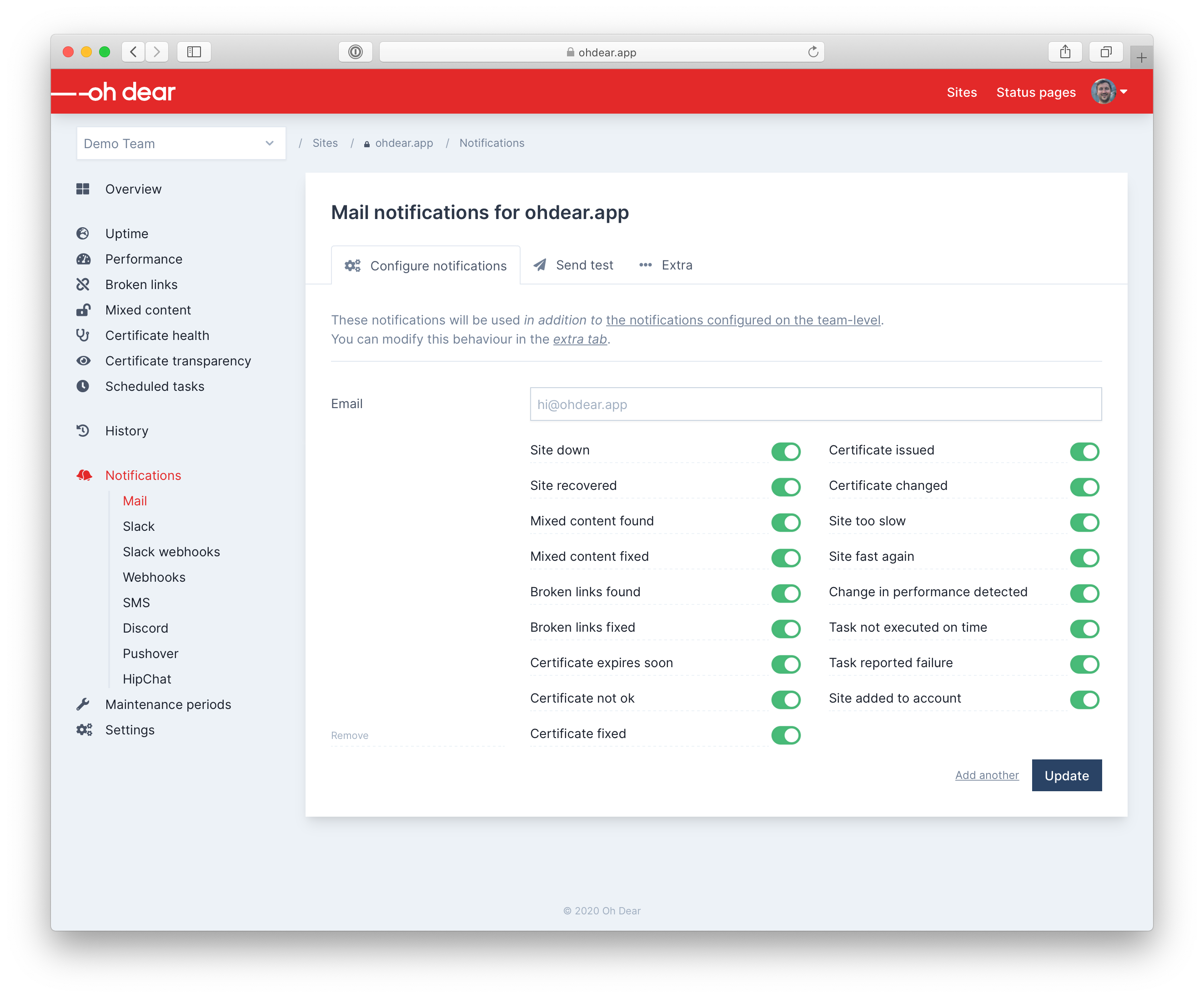
We've introduced a new primary color, too. You'll notice a touch of dark blue for action buttons. This gives us a bit more flexibility with our UI/UX, to make these stand out more for important actions.
What do you think? #
We hope you'll like these as much as we do!
If we hadn't convinced you yet, remember there's a 30% Black Friday discount available if you sign up with coupon code BLACK-WEEK-2020.
We've got a 10-day free trial, without any credit card obligation. Just give us a try with a username & password by registering and you're all set!


