Our redesigned status pages can now show uptime history
Published on June 11, 2023 by Freek Van der Herten

Next to the many checks we can perform, we can also render beautiful status pages to inform your audience about the health of your service.
Today, we've deployed a redesign of these status pages. In this iteration, everything is more polished. We picked a new font and colors and added some icons to make the status page a bit more visually interesting.
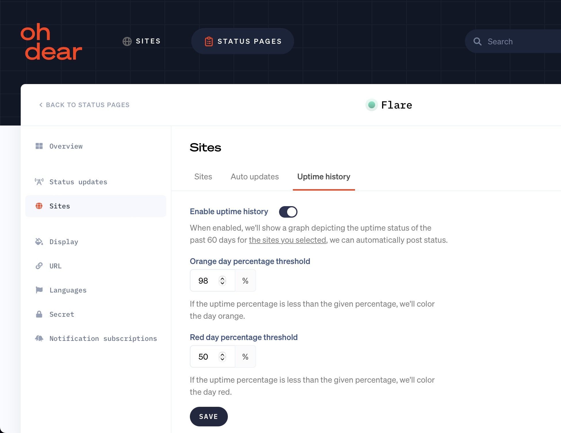
In addition to the cosmetic upgrade, we also added a significant new feature. We can now display 60 days of uptime history for your sites. Here's what that looks like (taken from the Flare status page).
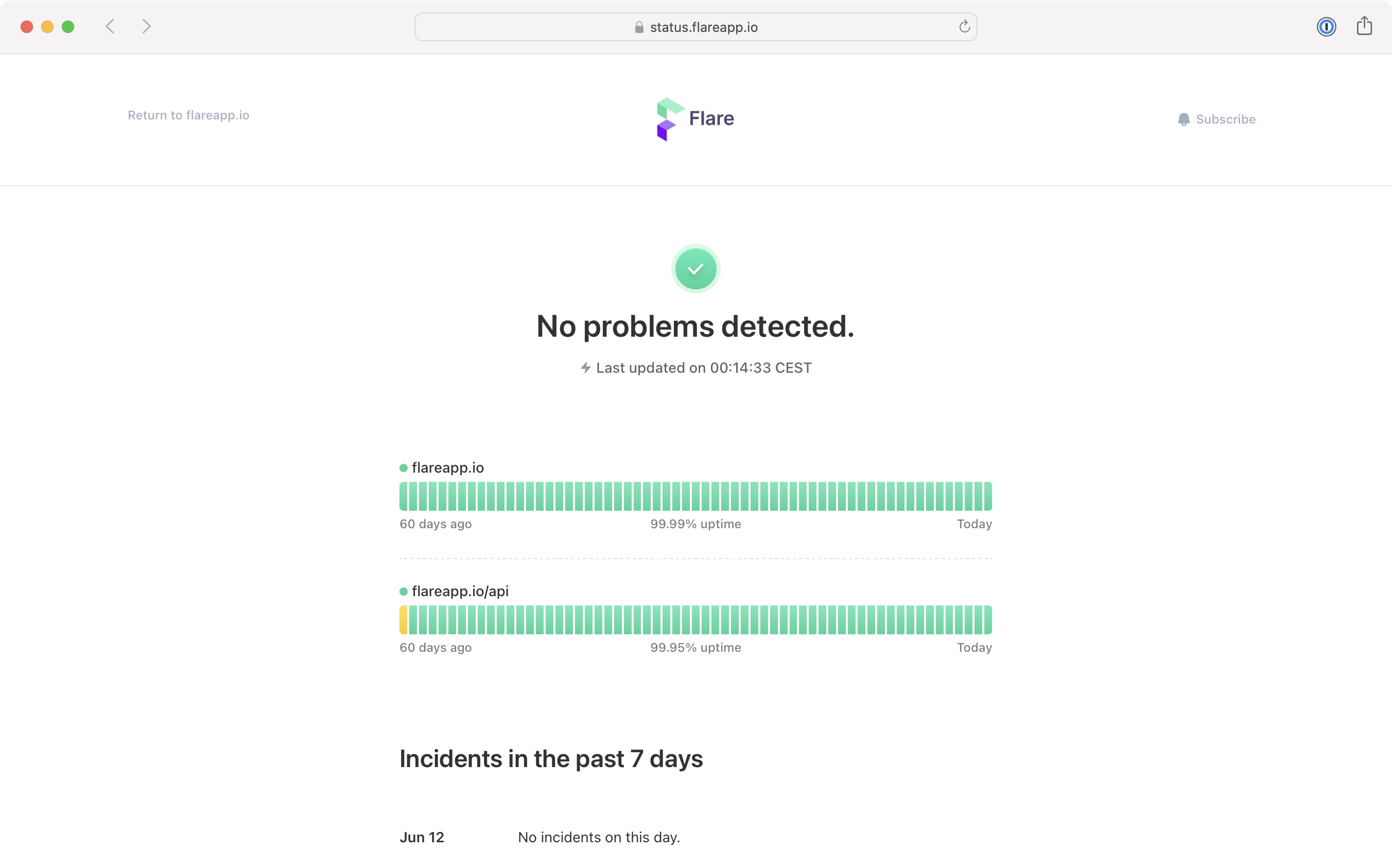
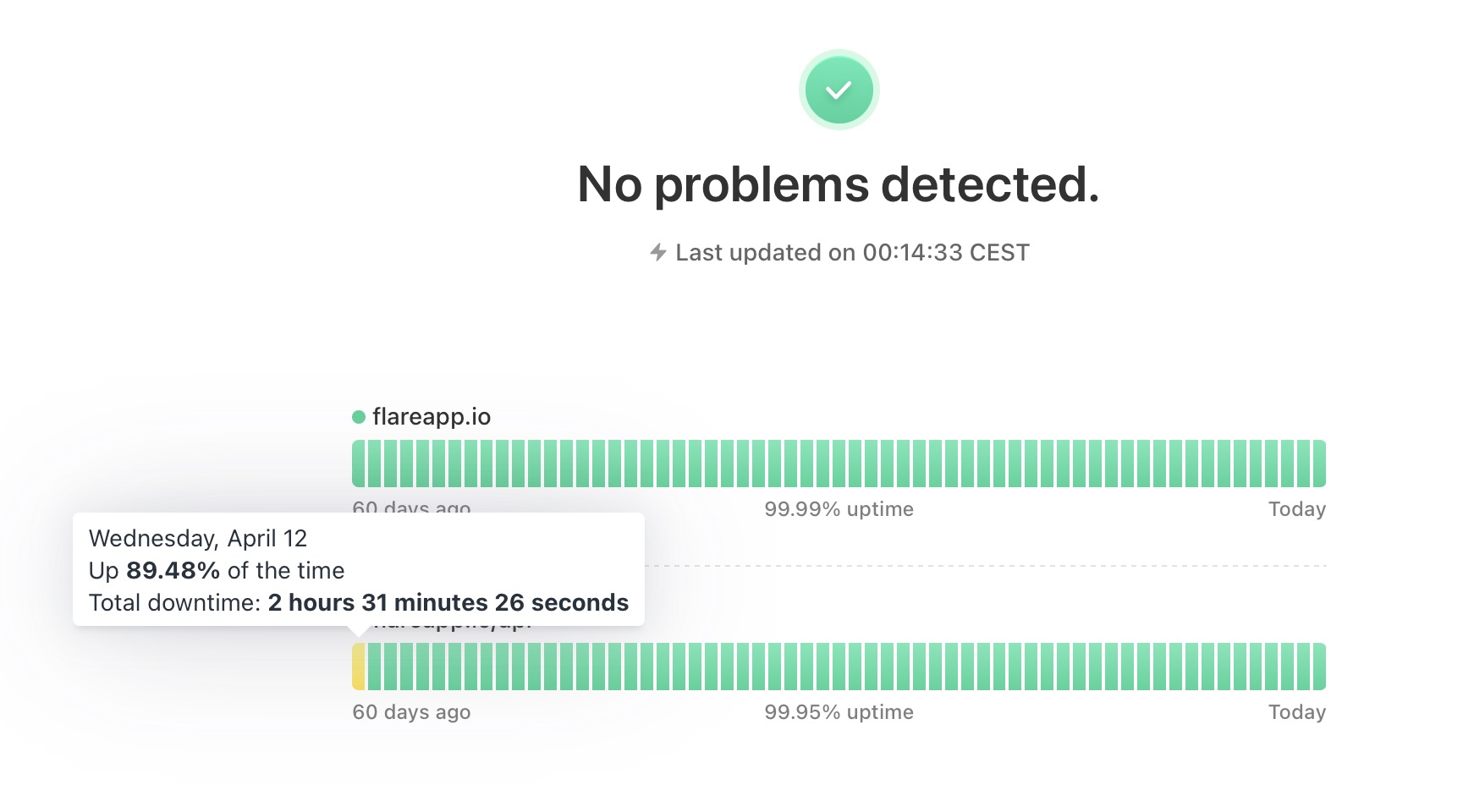
Every bar in the graph is a day. It's colored green when uptime is above 99% and orange when it's below that threshold. Of course, you can configure that threshold for your particular status page.
When you hover over a bar, you can see the exact amount of downtime.
We'll show the uptime history by default for a newly created status page. For the old status page, you'll need to manually enable it in your status page's settings.
We hope that you like this addition to Oh Dear! If you're not using Oh Dear to monitor your site, now's the perfect time to get started. We monitor uptime, SSL certificates, broken links, scheduled tasks, application health, DNS, domain expiry and more. We send notifications when something's wrong. All that paired with a developer-friendly API and kick-ass documentation.