Style and color
Maintaining brand consistency is crucial for creating a professional and cohesive status page. With Oh Dear status pages you can easily customise logo, logo position, heading/background colors as well as borders, shadows and even uptime history graph colors.
General settings #
You can customize various aspects of your status page's appearance, including:
- Header border width: Adjust the thickness of the bottom border around the header.
- Border radius: Control the roundness of button and uptime bar corners.
These settings are applied to both light and dark mode themes, ensuring the same look across different display preferences.
Theme #
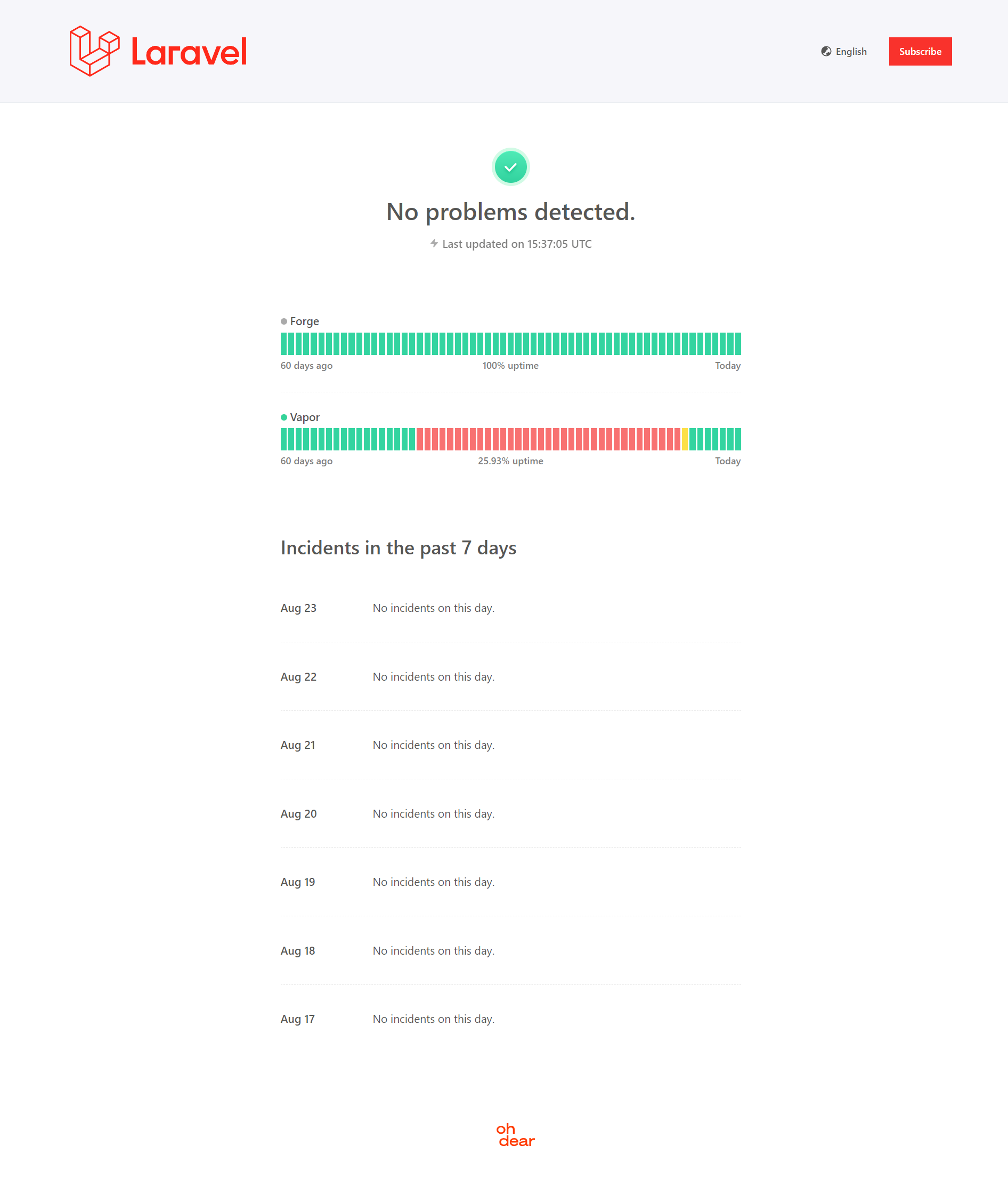
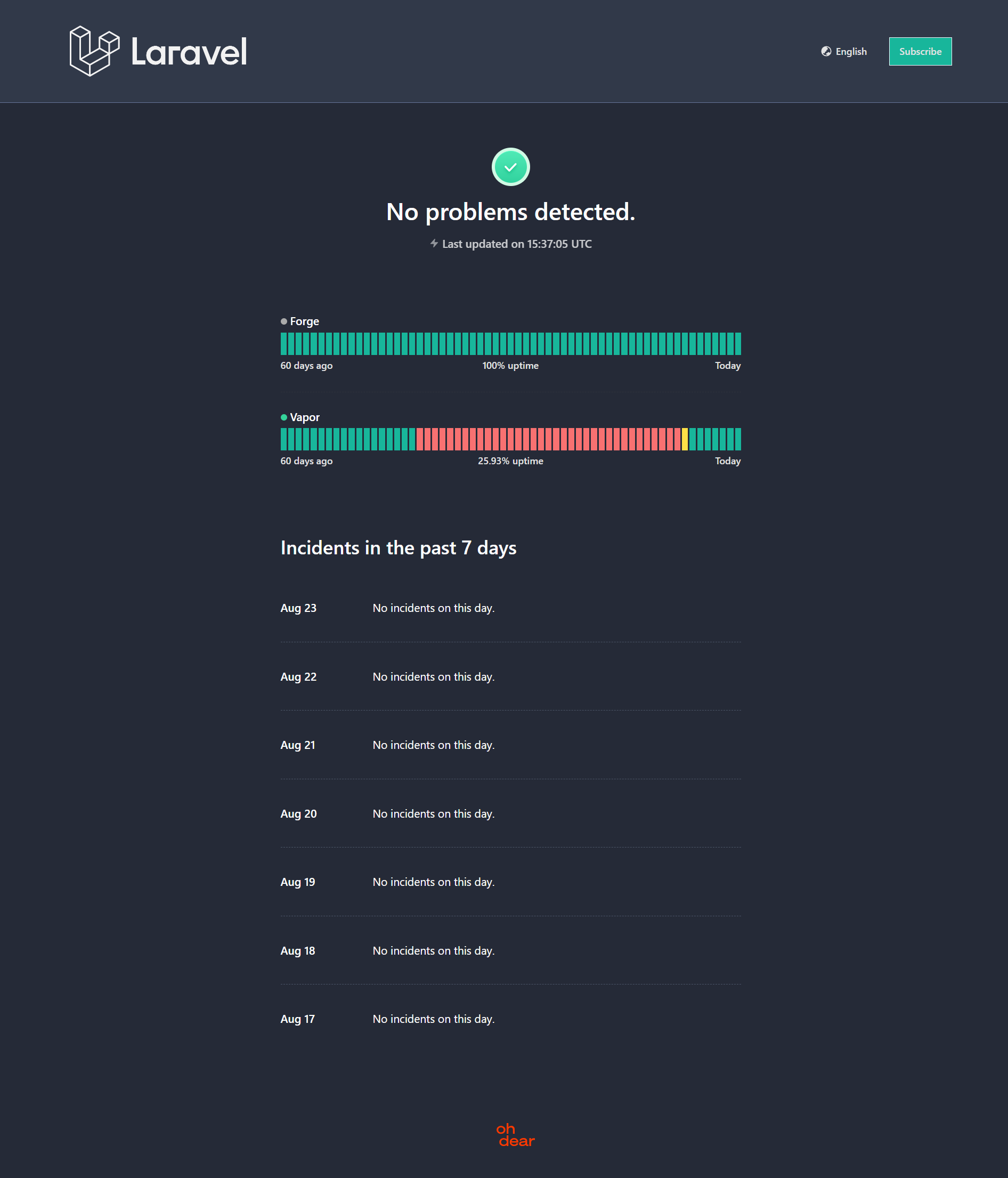
You can choose between a light, dark and system. The 'system' theme will automatically detect and display the relevant colors based on the user's device settings.
You can customise the logo and colors of dark mode separately providing you with full control over the look and feel of your status page.
Colors #
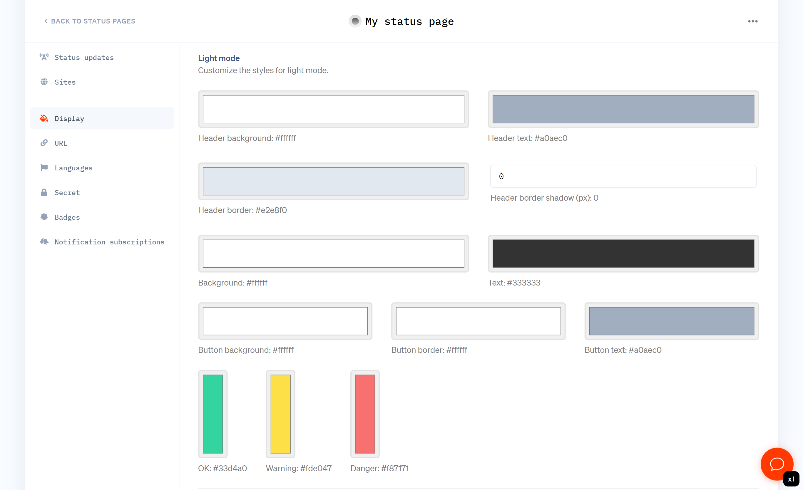
Oh Dear provides modern default color schemes for both light and dark modes, ensuring your status page looks great out of the box. However, we understand the importance of brand consistency so we provide the following color options across light and dark mode:
- Header (background / text / border / shadow)
- Background (background / text)
- Button (background / border / text)
- Uptime bar graph colors (ok / warning / danger)
Examples #
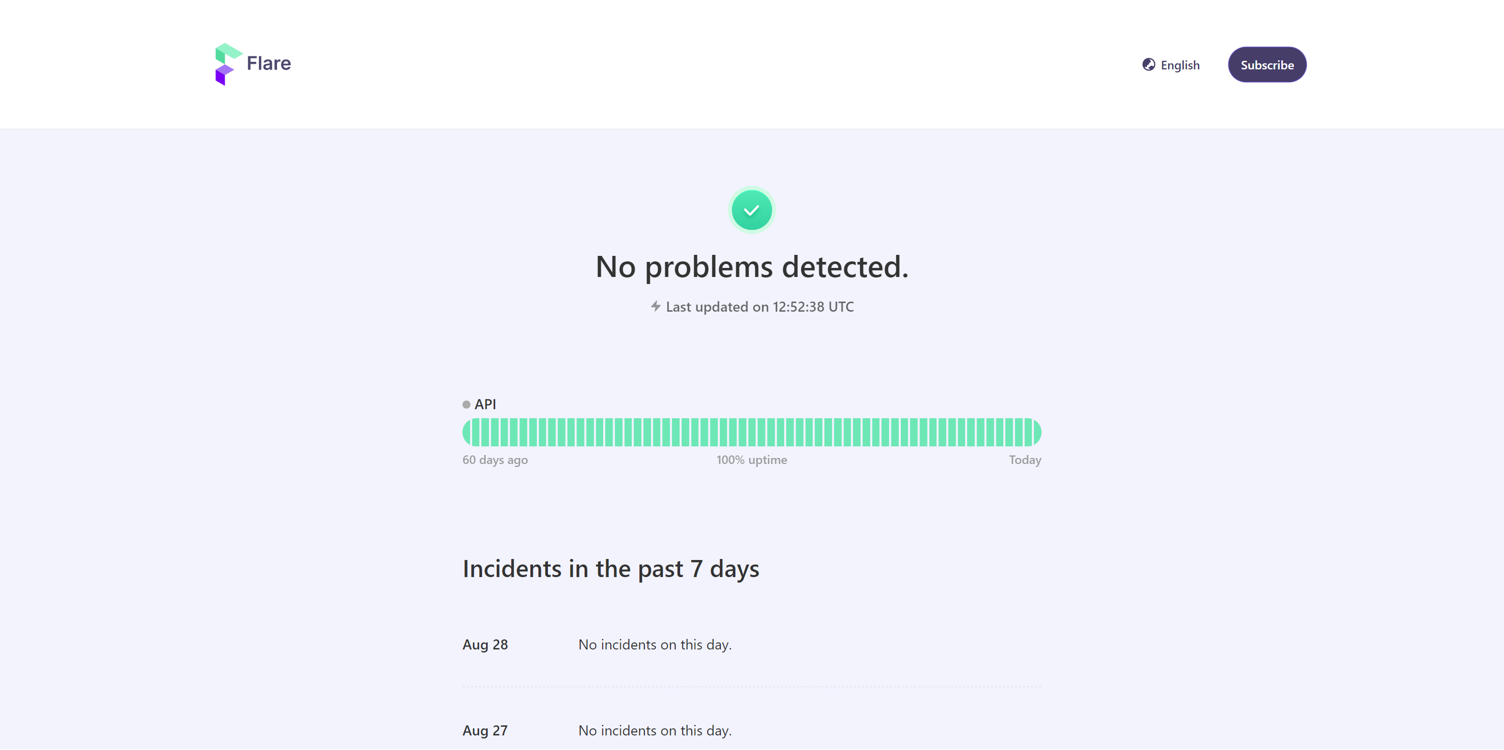
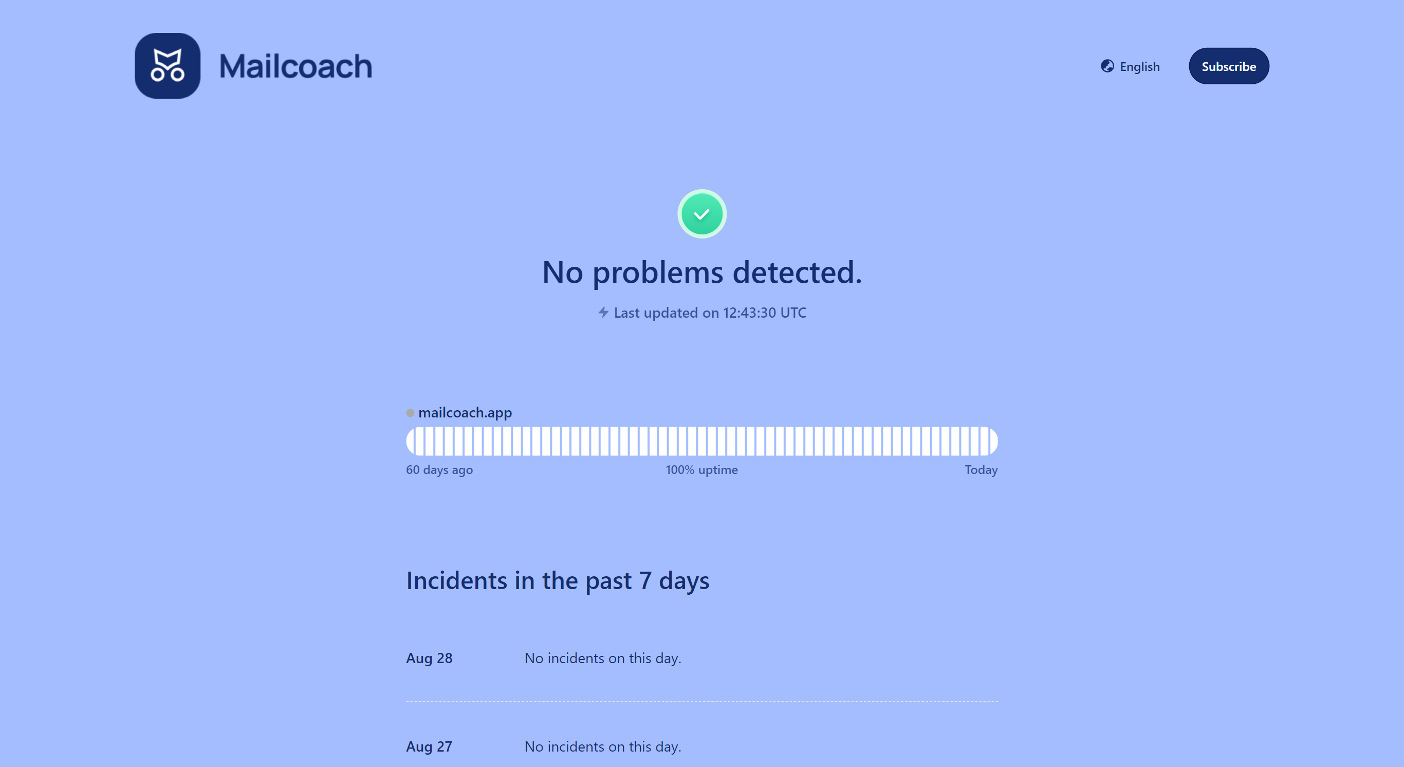
Please find below some examples of how different color schemes can be applied to a status page. Note: the monitors and uptime stats shown are for illustration purposes only.
Feel free to reach out via [email protected] or on X via @OhDearApp if you have any other questions. We'd love to help!
