Oh Dear is now mobile-friendly
Published on March 6, 2026 by Mattias Geniar

Oh Dear has always been a desktop-first tool. If you checked your monitors on your phone, you'd get the full desktop layout squeezed into a tiny screen, with lots of horizontal scrolling and tiny tap targets. That's fixed now. Every page in the app works on mobile.
What changed #
We didn't just slap some media queries on the existing layout. Some parts of the app needed a completely different approach on small screens. Here's what we did:
- New mobile navigation with a floating action button and full-screen menu overlay
- Dedicated mobile card layouts for monitor lists and status pages
- Scrollable tables with a visual hint that there's more to see
- Larger touch targets for toggles, checkboxes, and dropdown items
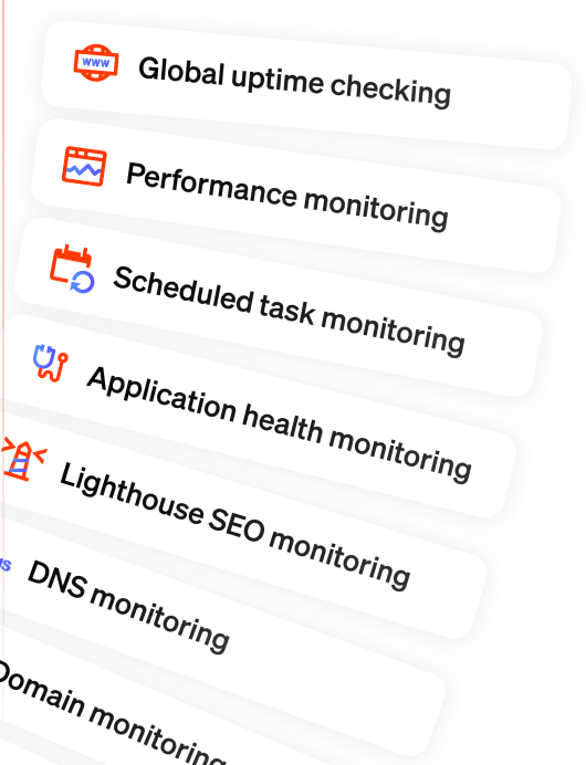
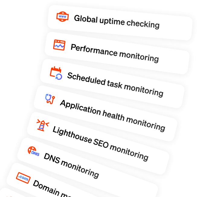
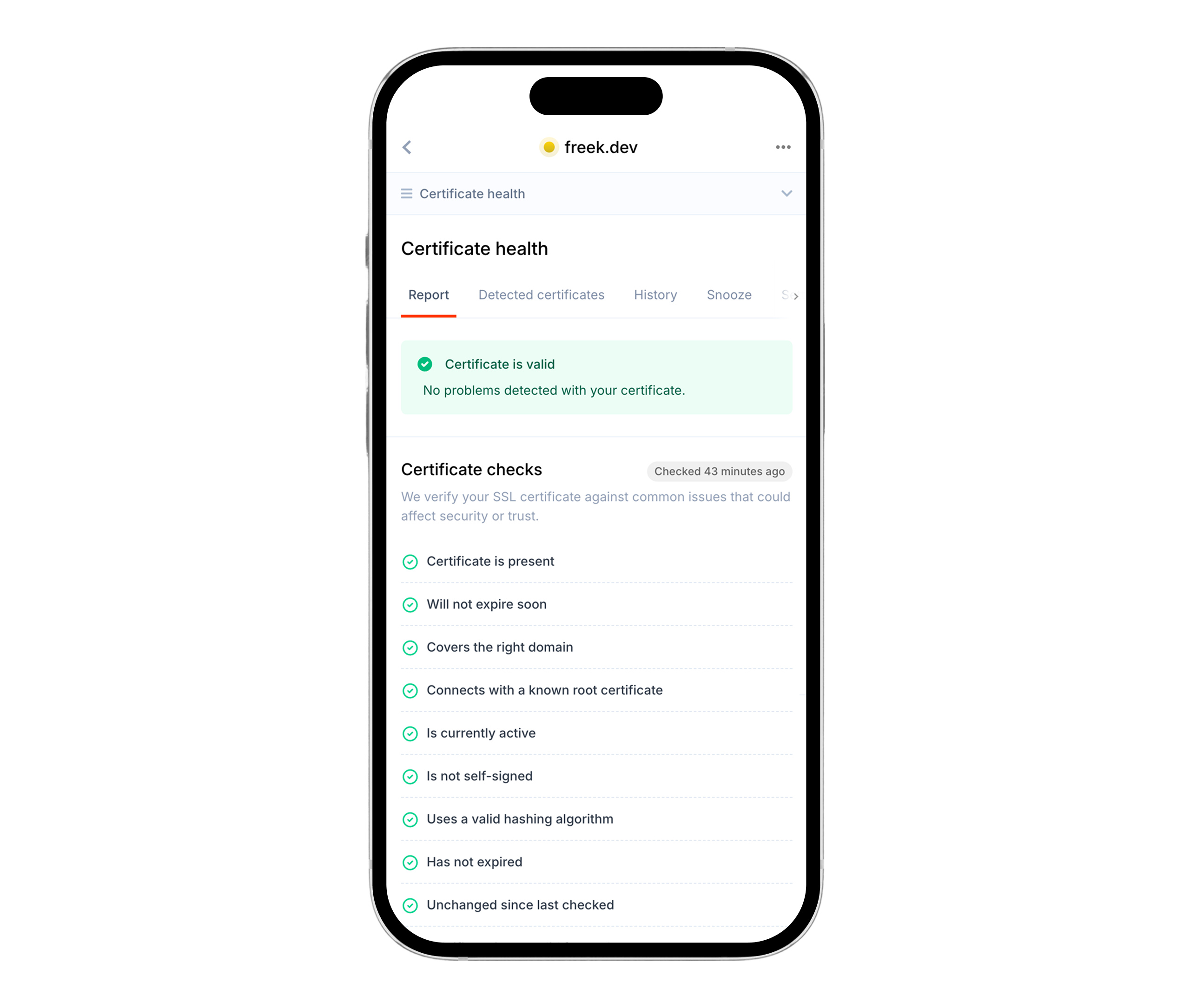
- Responsive check report pages for uptime, SSL, DNS, performance, broken links, and all other checks
- Mobile-friendly modals, forms, and settings pages
We touched over 160 Blade templates across the entire app.
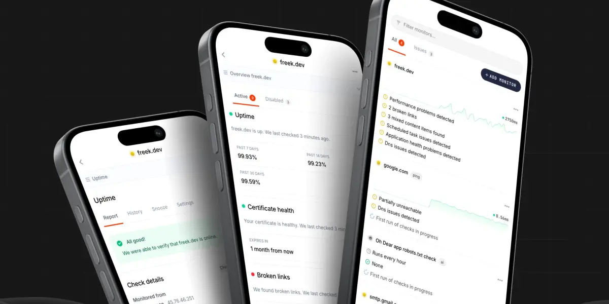
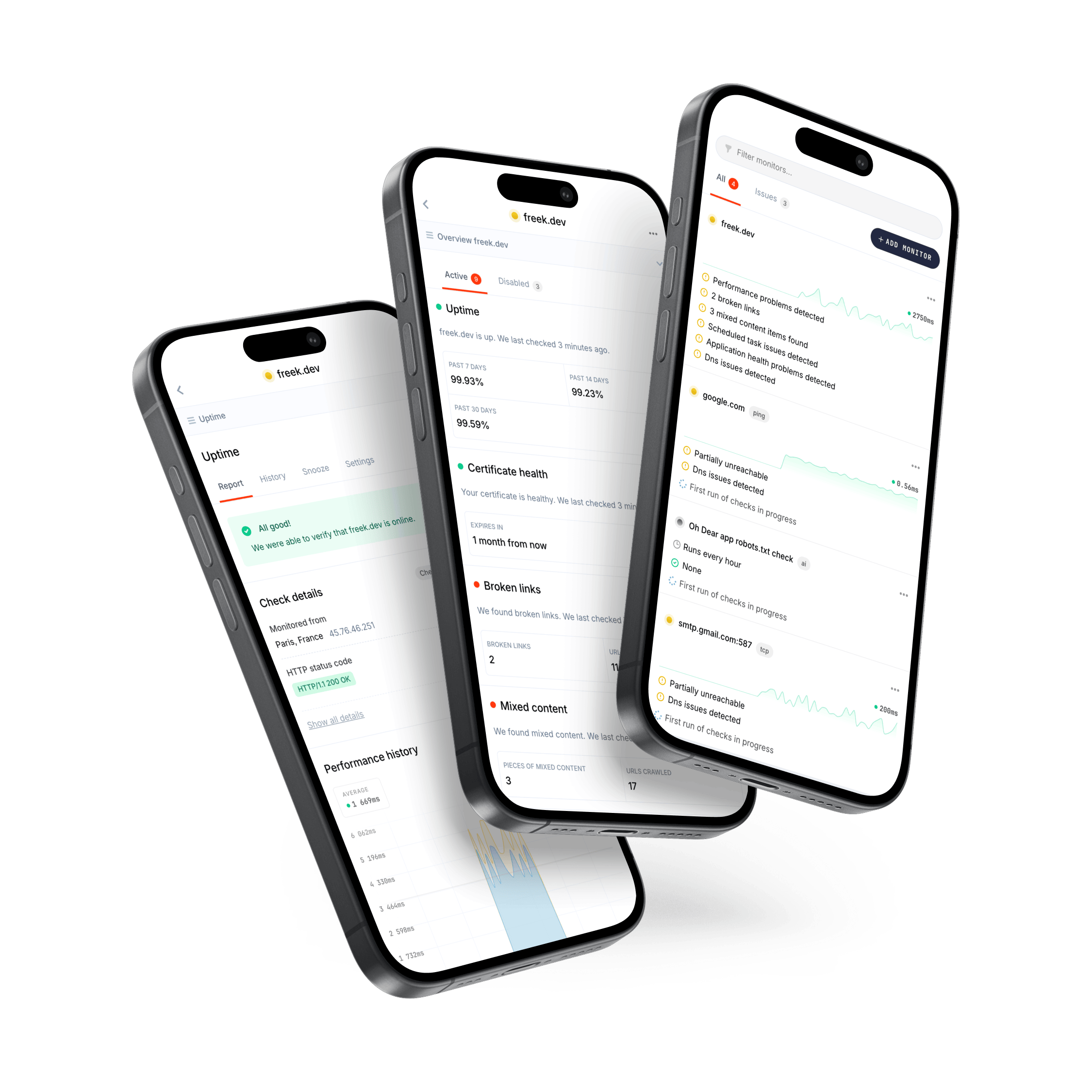
Optimize mobile views when you need them the most #
We send you alerts when we notice something doesn't seem right. That can be website downtime, broken links, failing scheduled tasks, ... You're probably going to click through on these alerts from inside your Slack, Discord, Teams or any other notification type we offer.
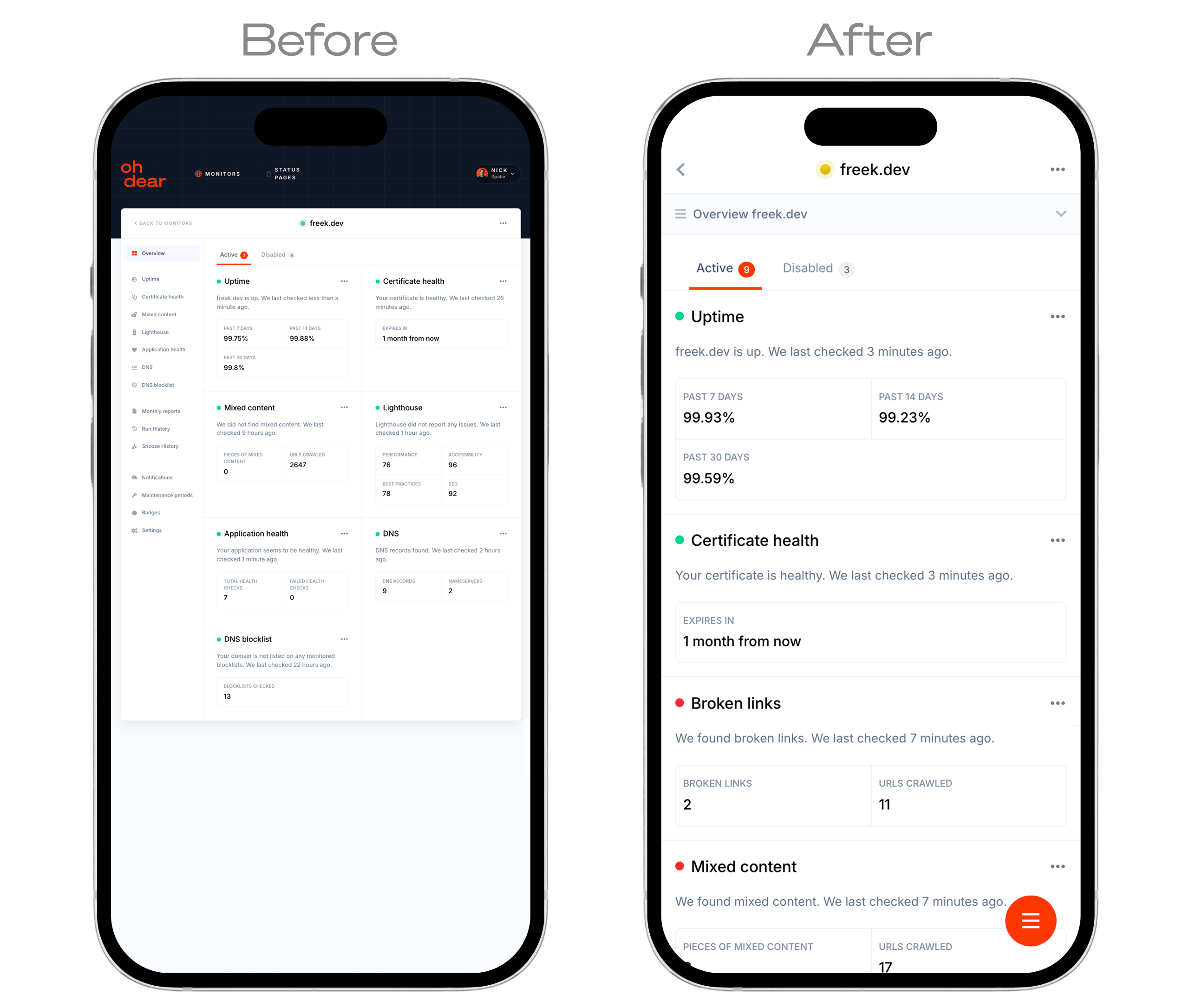
The page you're landing on, likely on your mobile device, needs to be optimized for that unhappy state: you want all the details of the problem we're reporting, at your fingertips.
The new layout is optimized for exactly that: getting all the necessary details, clearly visible, on mobile.
- Tables with multiple columns are replaced by stacked, labeled cards, so nothing gets clipped or overlaps
- Download and action buttons are always visible, never hidden behind menus
- Page headers and action buttons stack naturally instead of wrapping awkwardly
- "Copy to clipboard" icons are available where relevant, to easily share error messages, HTTP headers or reproduction steps with colleagues
When you get that alert that something is down, you're already in a stressful moment. The last thing you need is to fight the UI to find the details. Everything you need to diagnose and communicate the problem is right there, on whatever device you happen to have in your hand.
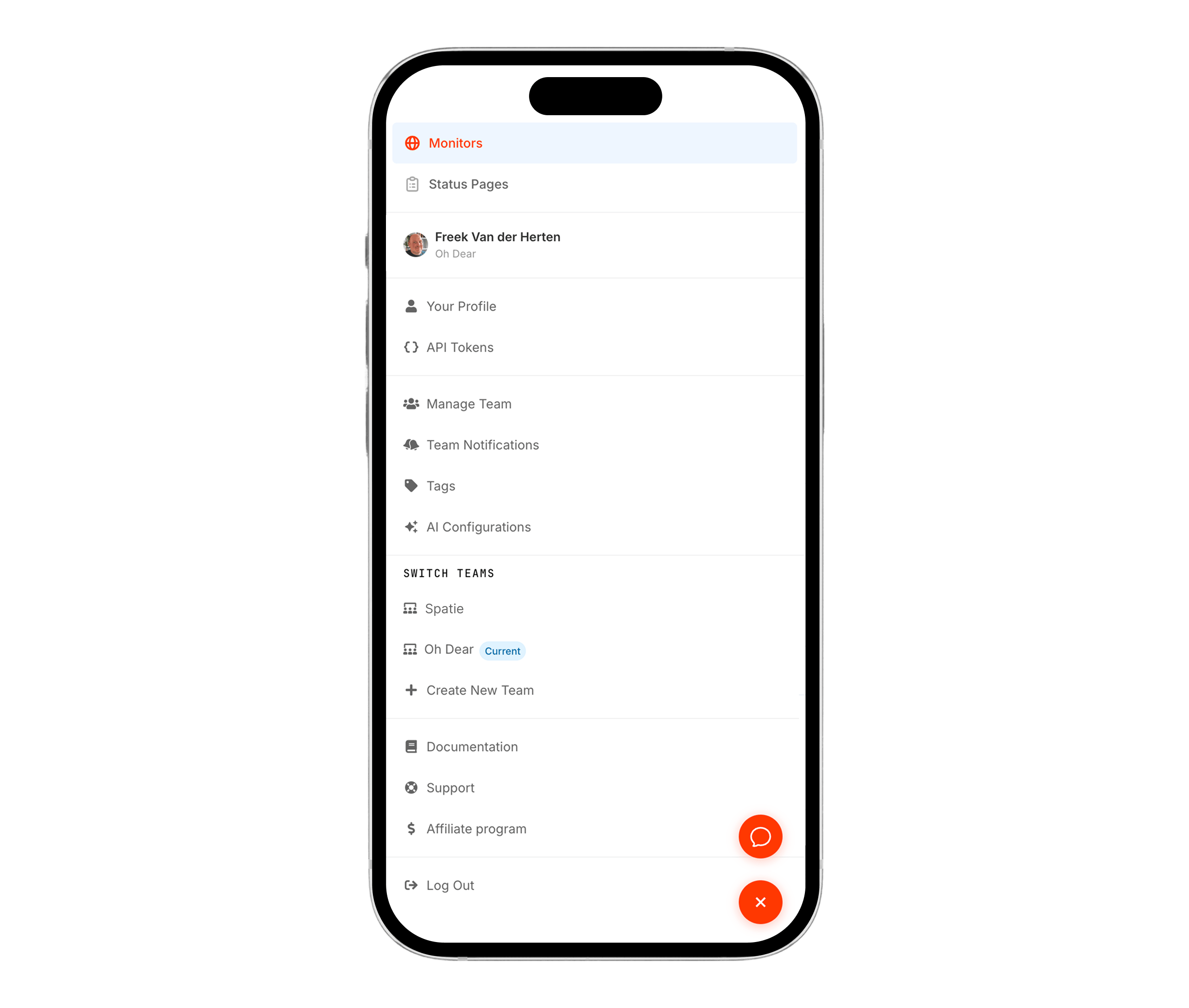
The floating menu #
On desktop, Oh Dear has a horizontal navbar with dropdowns for switching teams, accessing settings, and navigating between monitors and status pages. That doesn't work on a phone.
Instead of cramming the navbar into a hamburger menu at the top, we went with a floating action button (FAB) fixed to the bottom-right corner. It's always within thumb reach.
<button
    class="fixed bottom-6 right-6 z-[60] flex items-center justify-center
           w-12 h-12 text-white rounded-full transform-gpu bg-primary
           md:hidden shadow-glow-primary"
    @click="$store.appMobileMenu.isOpen = !$store.appMobileMenu.isOpen"
>

Tapping it opens a full-screen overlay with all the navigation options, organized vertically with generous padding for easy tapping. The menu uses an Alpine store ($store.appMobileMenu) as a shared state between the button and the overlay, which keeps things simple.
One nice detail: when the menu is open, we add overflow-hidden to the body so the page behind it doesn't scroll.
<div
    x-data
    x-effect="document.body.classList.toggle('overflow-hidden', $store.appMobileMenu.isOpen);
              document.body.classList.toggle('mobile-menu-open', $store.appMobileMenu.isOpen)"
>
The mobile-menu-open class also repositions our support bubble widget so it doesn't overlap with the menu button.
Two layouts instead of one #
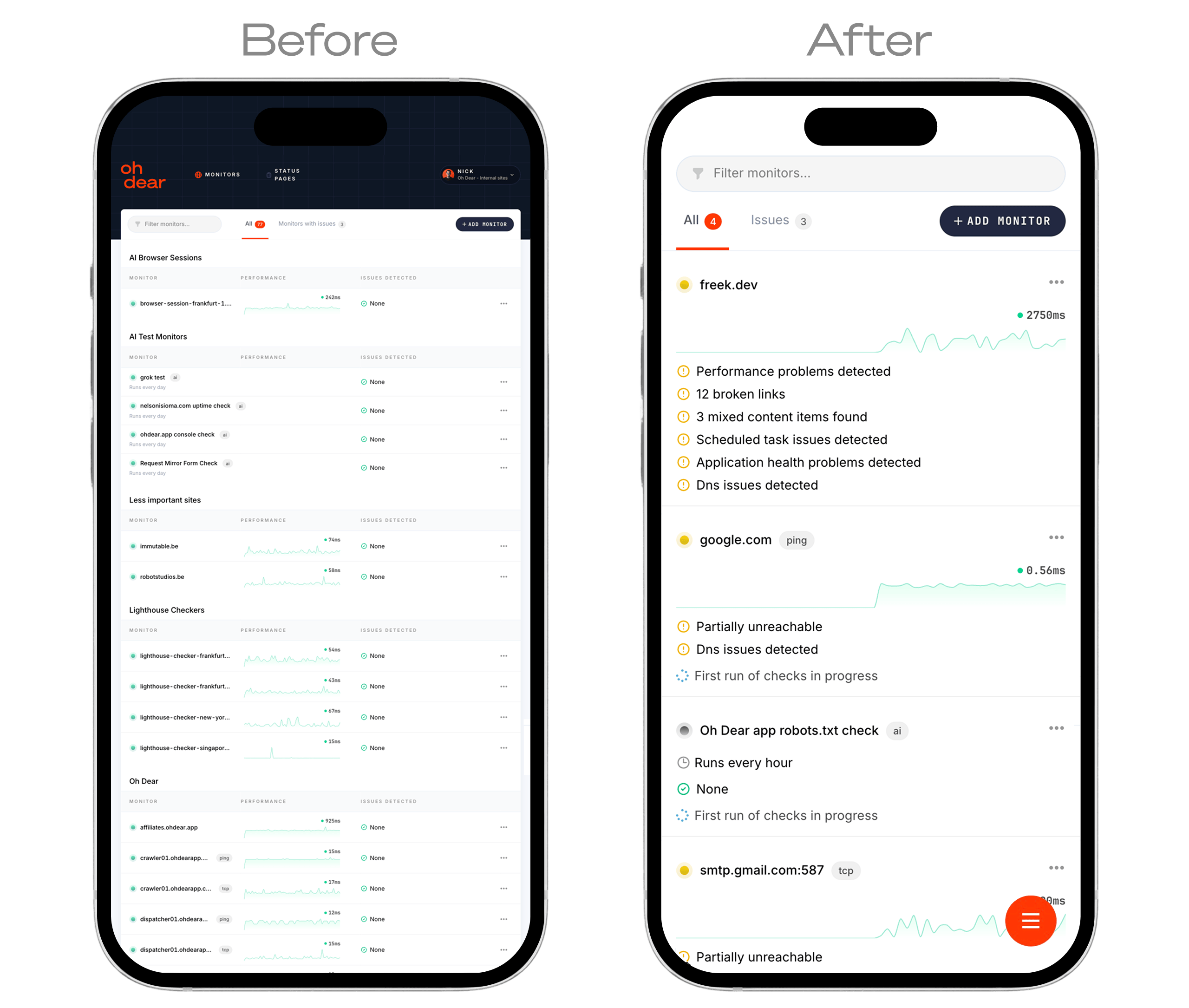
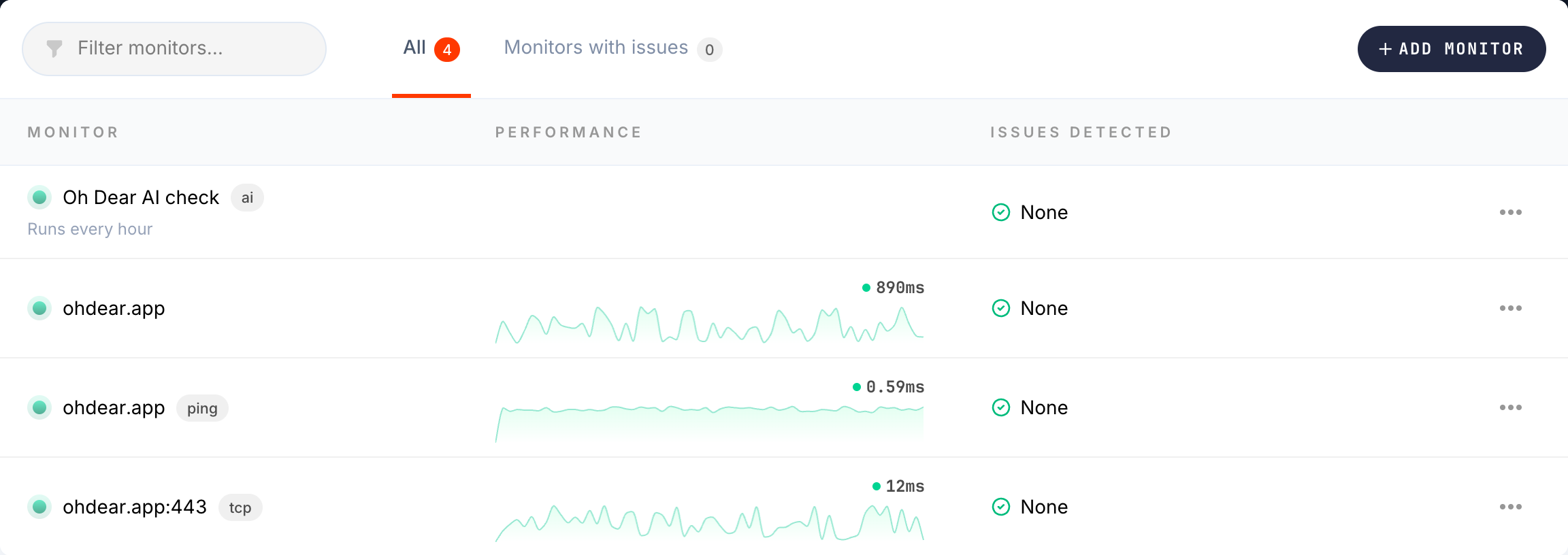
The monitor list is probably the most complex page in the app. On desktop, it's a multi-column table with performance sparklines, issue counts, and a hover-revealed actions menu.
Making that responsive with pure CSS would mean hiding columns, stacking cells, and losing the at-a-glance overview that makes the table useful. So we went with a different approach: render two completely separate layouts and show the right one based on screen size.
{{-- Desktop table layout --}}
<table class="hidden md:table w-full tabular-nums table-fixed">
    @include('app.monitors.list.components.monitorListRow')
</table>

{{-- Mobile card layout --}}
<div class="md:hidden divide-y divide-gray-150">
    @foreach($monitorsInGroup as $monitor)
        @include('app.monitors.list.components.monitorListRowMobile')
    @endforeach
</div>
The mobile card packs the essential info into a vertical layout: status indicator and name on top, tags inline, a mini performance chart below, and check summary messages as a list. Every row has a minimum height of 44px for reliable touch targets.
This is more code to maintain, but the result is clean on both screen sizes. No CSS hacks, no overflow issues, no squished text.
Scrollable tables with a fade hint #
Not every table needed a mobile-specific layout. For simpler tables (DNS records, certificate chains, downtime history), horizontal scrolling works fine. But users need to know the table extends beyond what they can see.
We built a small scrollable-table component that wraps any table and adds a gradient fade on the right edge:
<div
    x-data="{
        canScroll: false,
        atEnd: false,
        check() {
            const el = this.$refs.scroller;
            this.canScroll = el.scrollWidth > el.clientWidth;
            this.atEnd = el.scrollLeft + el.clientWidth >= el.scrollWidth - 1;
        }
    }"
    x-init="check()"
    x-on:resize.window="check()"
>
    <div class="scrollable-table-inner" x-ref="scroller" x-on:scroll="check()">
        {{ $slot }}
    </div>
    <div class="scrollable-table-fade" x-show="canScroll && !atEnd" x-cloak></div>
</div>
The fade automatically disappears once you scroll to the end. It only shows on screens where the table actually overflows, and it's hidden entirely on desktop where tables fit comfortably.
Bigger touch targets #
Small toggles and checkboxes are a constant frustration on mobile. We scaled up all form controls on small screens:
@media (width < theme(--breakpoint-mg)) {
    .check-toggle {
        @apply w-11 h-6;
    }

    [type='checkbox'],
    [type='radio'] {
        height: 1.25rem;
        width: 1.25rem;
    }
}
Dropdown menu items also get extra vertical padding on mobile, bringing them to a comfortable 44px touch height.
Try it out #
If you're an Oh Dear user, open the app on your phone. Everything should just work. Monitor lists, check reports, settings, notifications, status pages, all of it.
If something looks off on your device, let us know at support@ohdear.app or at @OhDearApp on X.