Dark mode is now available for the Oh Dear dashboard
Published on March 23, 2026 by Mattias Geniar

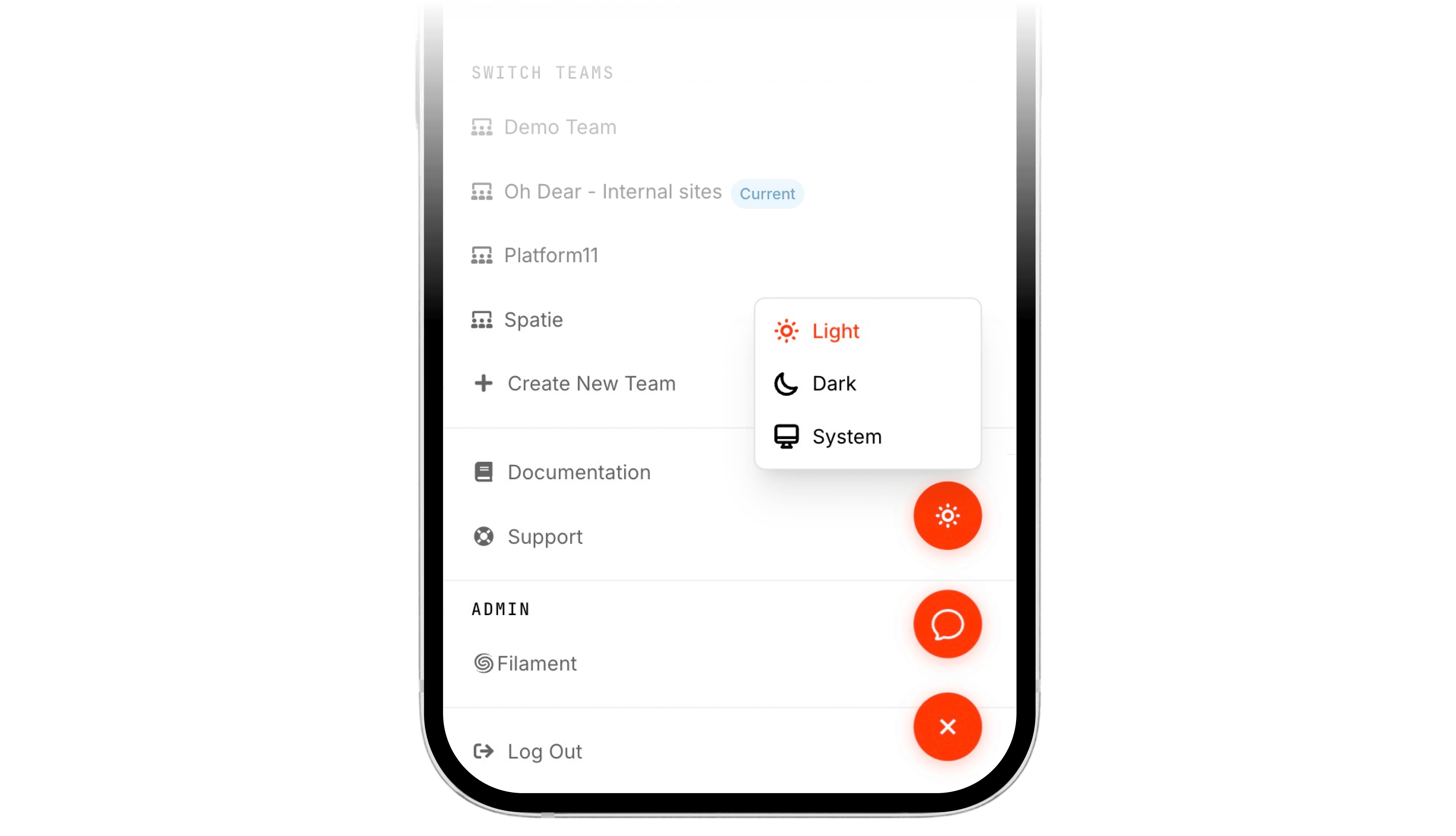
Oh Dear's dashboard now supports dark mode. You can choose between light, dark, or system-based theming, and your preference is saved to your profile so it follows you everywhere.
Three ways to theme your dashboard #
We've added three theme options to your profile settings:
- Light: The classic Oh Dear look you know.
- Dark: A carefully tuned dark palette across the entire app.
- System: Follows your operating system's preference automatically.
Your theme preference is saved to your account, not just your browser. That means it applies on every device, every session, and every tab you open.
No more flashbangs at 3 AM #
When your site goes down at 3 AM and you open the Oh Dear alert from Slack, the last thing you want is a blinding white screen burning your eyes.
If you've set your theme to "dark" or "system" (and your OS is in dark mode), your dashboard stays dark. Always. No matter how you got there, no matter which device you're on. Your eyes will thank you.
We specifically made sure the theme is saved on the profile, not just in a cookie or localStorage. When you click through from a Slack notification at midnight, your dark mode is already waiting for you.
Additional benefit: now that the dashboard is also mobile friendly, you won't only get a good-looking dark mode, but a well-rendered version of any page you visit.
It just looks really good #
Dark mode isn't just a comfort feature. It looks great.
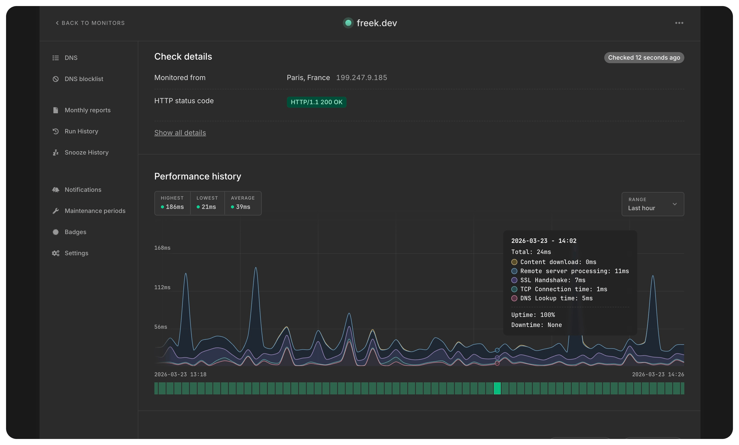
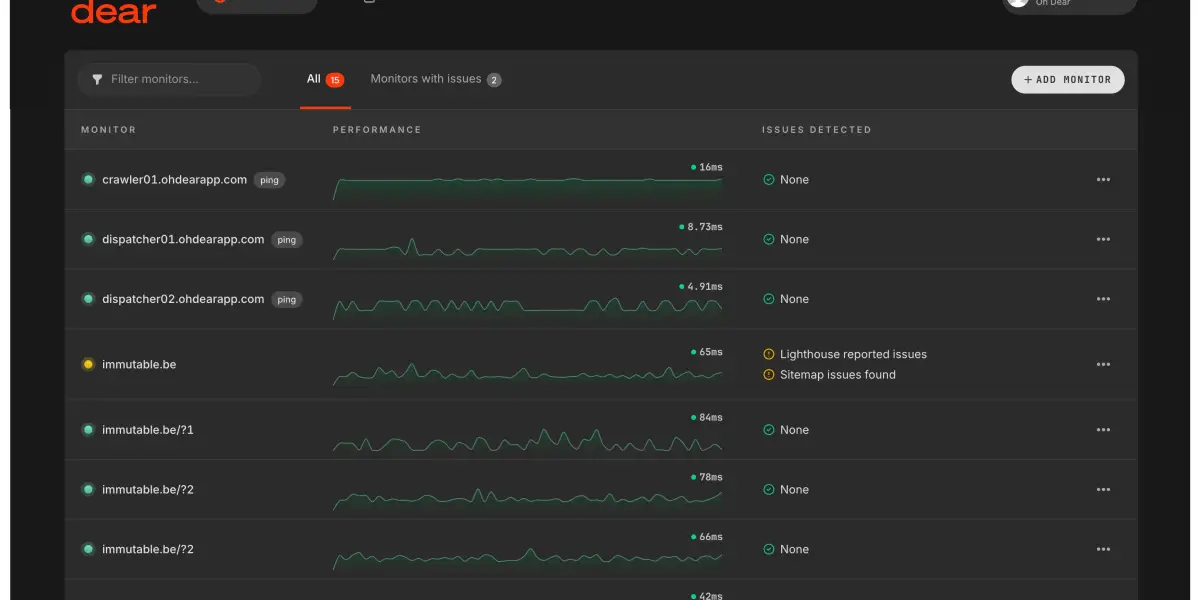
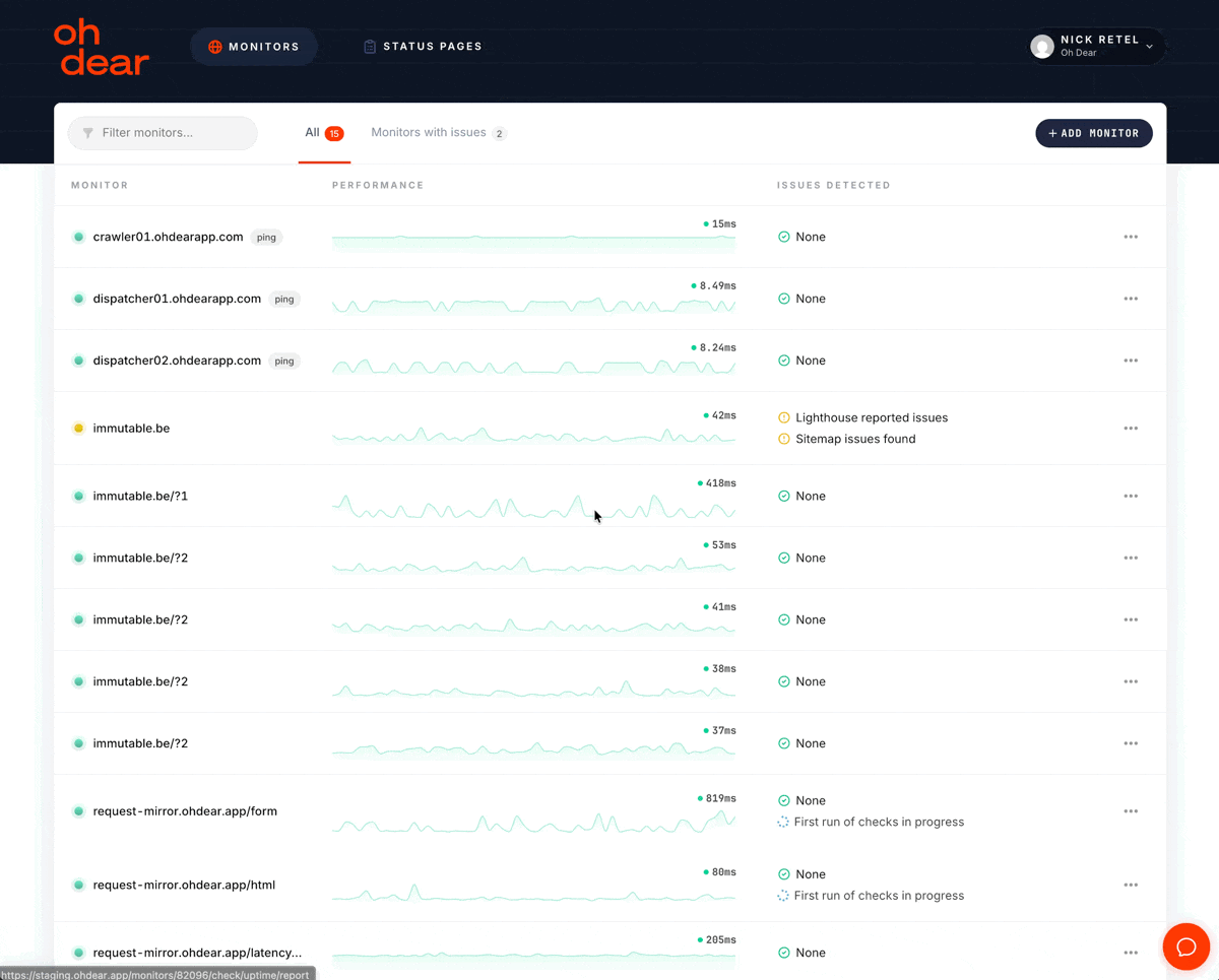
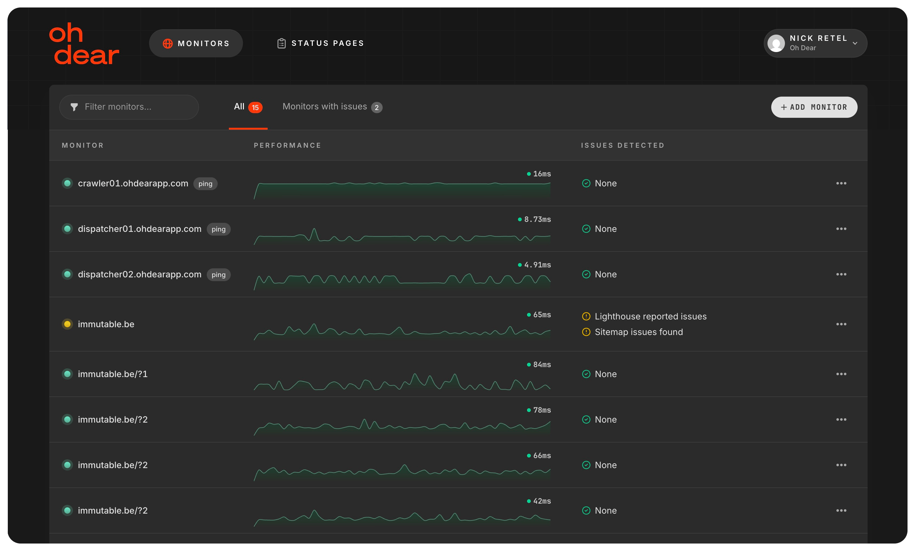
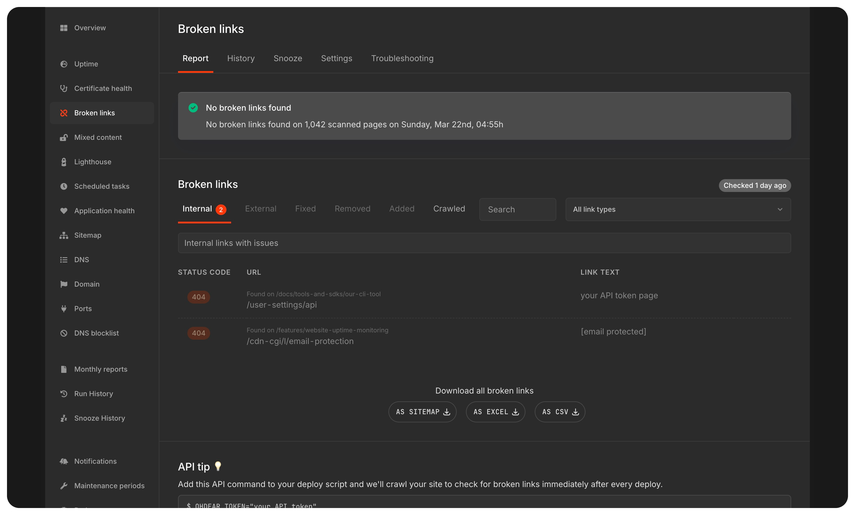
Charts, tables, status indicators, alert boxes, everything got its own carefully chosen dark palette. We didn't just invert colors. We picked backgrounds, borders, text contrasts, and accent colors that feel right together.
Even the performance charts have dedicated dark mode color sets, so your timing breakdowns are just as readable at any hour.
349 files, and a lot of dark: prefixes #
This was a big update. The PR touched 349 files with 2,718 additions and 1,531 deletions across the entire app. Every template, every component, every form, every table needed dark mode variants.
That's the kind of work where agentic coding really shines.
How we built it: AI for the repetitive parts, humans for the creative parts #
If you read our previous post about making Oh Dear mobile-friendly, this will sound familiar. The pattern was the same: let AI handle the tedious, repetitive work, and focus human effort on the parts that actually matter.
The agentic scaffold
We used Claude Code to generate the initial dark mode implementation across the entire codebase. The work was broken down into 8 user stories:
- Add theme preference to the user model
- Serve the theme preference to the app layout
- Build a theme switcher on the profile page
- Dark mode styles for the app layout shell
- Dark mode styles for content cards and panels
- Dark mode styles for form elements
- Dark mode styles for tables and data displays
- Dark mode styles for check report pages
Each of these was committed individually, with Claude as co-author. The agent worked through every Blade template, adding dark: Tailwind classes to backgrounds, text colors, borders, shadows, and interactive states. Hundreds of files, thousands of class additions, all done in a single session.
This is where AI is genuinely useful: applying a known pattern (dark:bg-gray-900, dark:text-gray-200, dark:border-gray-700) consistently across 349 files. It's not creative work. It's precise, repetitive, and easy to get wrong if you're doing it by hand.
The human side: getting the colors right
Adding dark: classes is the easy part. Choosing which colors, and making them feel cohesive across the entire app, that's where human judgment comes in. In our case, that human is called Nick.
The initial AI pass gave us structurally correct dark mode. Every element had a dark variant. But the palette didn't feel right. Backgrounds were too dark or too light. Text contrast was inconsistent. Borders disappeared or felt too harsh. The charts looked washed out.
Getting the theme right required sitting with the app, clicking through every page, and fine-tuning values until the whole thing felt intentional. Not just technically correct, but aesthetically coherent.
That's design work, and it's the part AI can't (yet?) do for you. It doesn't know that a particular shade of gray makes a card feel heavy, or that reducing border opacity by 10% makes a table feel lighter. It doesn't have opinions about whether a status indicator should be muted or vibrant in dark mode. Those are judgment calls that need a human eye.
The technical foundation
A few things we got right from the start:
Tailwind's class strategy: We use darkMode: 'class' in our Tailwind config, which toggles dark mode by adding a dark class to the <html> element. This gives us full control and avoids relying solely on the system media query.
No flash on page load: The theme script runs in the <head>, before any content renders. Whether you're in dark or light mode, you'll never see a white flash followed by a dark switch. It's instant.
Real-time system detection: If you've chosen "system" mode, we listen for OS-level theme changes. Switch your Mac to dark mode, and the Oh Dear dashboard follows immediately, no refresh needed.
Persistent preference: Your theme choice is saved to the database via your profile, with a localStorage fallback for immediate application. This means it works everywhere, instantly.
Give it a try #
Dark mode is available now for all Oh Dear users. Head to your profile settings and pick the theme that works for you.
And if you're the type who keeps their phone on dark mode 24/7, just set it to "system" and forget about it. Oh Dear will match your preference automatically.